
Now Reading: Paid Media Reporting Dashboard: 7 Essential Metrics
-
01
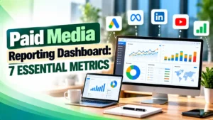
Paid Media Reporting Dashboard: 7 Essential Metrics
Paid Media Reporting Dashboard: 7 Essential Metrics

A practical guide to building a paid media reporting dashboard that actually holds up. Covers the core metrics that matter, how Google Ads, Meta, and LinkedIn's native reporting differ from a blended view, the real tools used to build one, and the attribution window mismatches that quietly inflate conversion counts.
Hey! If you have ever pulled an all nighter stitching together three export files from three different ad platforms just to answer "how did we do last month," this one is for you.
Picture this: your boss asks for last week's numbers, and you have four browser tabs open, two spreadsheets mid export, and a nagging feeling that none of the totals actually agree with each other. A real paid media reporting dashboard is the fix, and it is a lot more achievable than it sounds.
What Is a Paid Media Reporting Dashboard, Really?
A paid media reporting dashboard is a single view that pulls spend, conversions, and efficiency numbers from every ad platform you run, so you can see performance without logging into Google Ads, Meta Ads Manager, and LinkedIn Campaign Manager separately.
It is not just a prettier version of native reports. It lines up numbers that were never designed to sit side by side in the first place.
As of October 2026, connector tools and native APIs are more mature than a few years ago, which helps. The growing number of campaign types and attribution settings across platforms makes the job harder at the same time.
Most teams building a paid media reporting dashboard for the first time underestimate how much of the work is deciding what NOT to show, not just what to include.
The Core Metrics That Actually Belong On It
Six numbers do most of the real work across almost every paid channel. The rest is usually there to make a report look busy.
| Metric | What It Actually Tells You |
|---|---|
| ROAS | Revenue returned per unit of spend, the headline efficiency number for ecommerce style accounts |
| CPA | What one conversion costs, the number most lead generation accounts should watch first |
| CTR | How well your ad copy and targeting earn a click once someone sees the ad |
| Conversion rate | How well the click actually turns into a result once someone lands on your page |
| Spend pacing | Whether a budget is on track to finish on time, early, or run out before the cycle ends |
| Impression share | The share of available impressions your ads actually captured versus what you were eligible for |
Impression share is worth sitting with for a second, since it is the one marketers tend to skip. Per Google Ads Help, it is simply impressions divided by total eligible impressions, which means it tells you how much of your own addressable audience you are even showing up for before CTR or conversion rate get a chance to matter.
Tip
Do not report CPA or ROAS in isolation. Pair each one with spend pacing on the same screen of your paid media reporting dashboard, since a great CPA sitting on a badly underspent budget is not actually a win. Our Performance Max reporting guide walks through why this pairing matters even more once Google is making automated budget decisions for you.
Platform Native Reporting vs a Blended Dashboard
Google Ads, Meta Ads Manager, and LinkedIn Campaign Manager each give solid reporting for their own platform. The problem shows up the moment you run all three at once.
LinkedIn's own native reporting is a good example of what gets stuck. It covers impressions, clicks, CTR, cost per lead, and useful audience breakdowns by job title, but that data stays inside Campaign Manager, so combining it with Google Ads or Meta numbers still usually means a manual CSV export.
Meta Ads Manager has the same limitation in reverse. It shows Meta specific results well, but has no concept of your Google Ads spend that same week.
A blended paid media reporting dashboard exists specifically to close that gap. It does not replace the native reports, it sits above them, pulling one ROAS number, one CPA number, and one spend total that actually represents the whole account, not just one slice of it.
The Real Tools People Use to Build One
Three approaches cover almost every real paid media reporting dashboard in production today, and most teams end up using more than one of them together.
Google Looker Studio connectors. Google's own connector pulls Google Ads data directly into Looker Studio, and manager accounts can report on up to 50 sub accounts from one data source using its combined Overall Account Fields list. Some older fields have since been deprecated, including location extension fields retired in May 2026 and the Auction Insights fields removed in 2024.
Native platform APIs. For more control than a connector gives, the Google Ads API lets a developer query almost any performance data point down to the keyword level using its own query language. Meta and LinkedIn both expose comparable marketing APIs, which is how most third party tools get their data in the first place.
Spreadsheet based reporting. Still the most common entry point for smaller accounts. Tools built around this model pull live platform data straight into rows and columns, then layer dashboards or an assistant on top once the numbers are flowing in correctly.
Tip
Whichever tool you pick, give every pulled field a consistent naming convention before you build a single chart. A messy source table makes every chart downstream harder to trust, and it also makes it much easier to accidentally double count a conversion. Our guide on UTM parameters is a good companion read here, since clean UTM tagging is what keeps a blended dashboard's traffic source column actually accurate.
Google's own Looker Studio Google Ads connector removed support for Auction Insights fields back in 2024, and several location extension fields followed in May 2026. Google's Looker Studio documentation notes these changes directly, which means an older, unmaintained template can quietly go stale without throwing any visible error.
Attribution Window Mismatches: The Pitfall Nobody Warns You About
This is the single biggest reason a well built paid media reporting dashboard can still show numbers that do not add up, and it rarely gets explained clearly.
Every platform decides for itself how long after an interaction it will still credit a conversion, and the defaults genuinely differ.
| Platform | Default Attribution Window |
|---|---|
| Google Ads | Up to a 30 day click window and a 1 day view window by default, adjustable from 1 up to 90 days depending on the conversion source |
| Meta Ads Manager | A 7 day click window and a 1 day view window by default, with narrower or no view through options available |
| LinkedIn Campaign Manager | Last click attribution, with far less flexibility to adjust the window than either Google or Meta |
Put plainly, a conversion that happens eight days after someone clicked a Meta ad will not be credited to Meta at all under its default window, even if that same person clicked a Google Ads campaign along the way and gets credited there instead, inside Google's longer default window. Neither platform is wrong. They are simply measuring on different clocks.
Meta's default attribution setting in Ads Manager is a 7 day click and 1 day view window, meaning a conversion only counts if it happens within seven days of a click or one day of a view with no click at all. Jon Loomer's attribution setting guide breaks this down in detail, and notes the comparison report can add a 28 day click column if you want to see the gap for yourself.
If your blended dashboard just sums the conversion columns from each platform without accounting for this, you will overcount. Two platforms can legitimately claim the same real world sale. A proper dashboard either labels platform reported conversions as directional, or layers in a separate, platform agnostic attribution model, like the ones explained in our attribution models guide and our breakdown of first click, last click, and data driven attribution.
How to Avoid Vanity Metrics in Your Paid Media Reports
Not every number a platform offers deserves a spot on your dashboard, and some actively mislead the reader.
A useful way to sort metrics, as PPC strategist Navah Hopkins lays out in Search Engine Journal, splits them into three buckets: core metrics that are real success or failure indicators, directional metrics that guide decisions without carrying accountability, and vanity metrics that mostly just make a report look busy.
For a sales focused account, conversions, CPA, ROAS, and conversion rate sit in the core bucket, while CTR and impression share are directional. Quality score and raw impressions land in the vanity bucket for that goal, even though they are not meaningless numbers overall.
The classification flips for a brand awareness campaign, where impression share and raw impressions move up into the core bucket instead. Match the metric to the actual campaign goal before deciding what counts as a win.
Common Mistakes to Avoid When Reporting on Paid Media
Most dashboard problems trace back to one of a handful of repeat mistakes, not a tooling failure.
Spend pacing deserves special attention, since it is the metric most likely to be missing entirely from a first draft dashboard. Per NinjaCat's own breakdown of budget pacing, tracking cycle length, budget cap, and spend to date lets you catch an overspend or underspend days before the cycle ends. Our own look at a recent Google Ads budget pacing update covers a closely related change worth knowing about.
Tip
Schedule a recurring half hour every week purely to sanity check your paid media reporting dashboard against each platform's native numbers. Small drift between the two is normal given attribution differences, but a large, sudden drift usually means a connector broke, not that performance actually changed.
At minimum, cover spend, ROAS or CPA depending on your goal, CTR, conversion rate, spend pacing, and impression share, pulled from every platform you actually run campaigns on rather than just your largest one.
Google Ads defaults to a 30 day click and 1 day view attribution window, while Meta Ads Manager defaults to a 7 day click and 1 day view window. A sale happening on day 8 after a Meta click simply will not get credited there, even if Google's longer window still catches it.
For many accounts, yes, especially using Google's own Google Ads connector alongside partner connectors for Meta and LinkedIn. Larger or more complex setups often add the native platform APIs or a spreadsheet layer underneath for extra control.
Any metric that looks impressive but is not actually tied to your campaign's real goal. Quality score and raw impression counts are classic examples for a sales focused campaign, even though those same numbers can be genuinely core for a brand awareness goal instead.
Weekly at minimum for any actively spending account, with a quick daily glance at spend pacing specifically during the first and last few days of a budget cycle, when overspend or underspend risk is highest.
Learn Today
ROAS
Revenue generated per unit of ad spend, the primary efficiency metric for ecommerce campaigns.
CPA
Cost per acquisition, what one conversion actually costs you on average.
Impression Share
Impressions you actually received divided by the total impressions you were eligible for.
Spend Pacing
Tracking whether a budget is on track to finish on time across its full cycle.
Attribution Window
The length of time after a click or view that a platform will still credit a conversion.
Blended Dashboard
A single report combining data from multiple ad platforms into one comparable view.
Ready to Build a Paid Media Reporting Dashboard That Actually Holds Up?
Explore more Brandella Journal guides on SEO and digital marketing.