
- Home
- SEODiscover the latest updates from across the United States, including politics, culture, economy, and trending stories. Stay informed on the key events shaping the nation and the topics everyone’s talking about.
- Technical SEOLearn technical SEO concepts including crawling, indexing, XML sitemaps, robots.txt, canonical tags, site architecture, and website performance.
- Local SEOOptimize your business for local seo with Google Business Profile, local citations, reviews, maps, and location-based SEO.
- Mobile SEOImprove your website’s mobile seo performance with responsive design, mobile-first indexing, usability, and page speed optimization.
- On-Page SEOExplore on-page seo optimization techniques such as title tags, meta descriptions, headings, URLs, internal linking, and content optimization.
- Off-Page SEODiscover off-page SEO strategies such as backlinks, digital PR, brand mentions, outreach, and authority building.
- SEO ToolsExplore the best SEO tools for keyword research, technical audits, backlink analysis, rank tracking, and website optimization.
- Core Web VitalsLearn how to improve Core Web Vitals including LCP, INP, CLS, page speed, and overall user experience for better rankings.
- Keyword ResearchLearn how to find profitable keywords, analyze search intent, evaluate competition, and build effective keyword strategies.
- Link BuildingMaster ethical link building techniques, backlink analysis, outreach methods, guest posting, and authority growth strategies.
- Google Search ConsoleLearn how to use Google Search Console to monitor indexing, fix errors, analyze search performance, and improve SEO.
- SEO BasicsLearn the fundamentals of search engine optimization (SEO Basics), including how search engines work, SEO terminology, and beginner-friendly best practices.
- Paid Media
- Display AdvertisingLearn display advertising strategies, banner ads, audience targeting, remarketing, Google Display campaigns, and optimization techniques.
- Google AdsLearn Google Ads strategies, campaign setup, bidding, keywords, Performance Max, Search Ads, and optimization techniques.
- LinkedIn AdsLearn LinkedIn Ads strategies for B2B marketing, lead generation, audience targeting, campaign optimization, and paid social advertising.
- Meta AdsLearn Meta Ads strategies for Facebook and Instagram, including campaign setup, targeting, retargeting, and performance optimization.
- Paid Media AnalyticsLearn paid media analytics, including CPC, CTR, CPA, ROAS, conversion tracking, attribution, reporting, and campaign performance analysis.
- PPC StrategyLearn effective PPC strategies, campaign planning, bidding, keyword targeting, landing pages, conversion optimization, and more.
- ContentTransform your living spaces with inspiration, tips, and trends in interior design. From minimalist decor to bold statements, find ideas for every style and budget.
- Social
- Digital MarketingExplore stories and advice on living your best life. From personal growth to entertainment, dive into the latest in lifestyle trends and inspiration.
- Artificial IntelligenceStay informed about health and wellness with expert advice, fitness tips, and the latest medical breakthroughs. Your guide to a healthier and happier life.
- DevelopmentYou will find development related educational articles
- GTMLearn Google Tag Manager (GTM) with practical guides for tags, triggers, variables, tracking, conversions, and website analytics implementation.
- HTMLLearn HTML with simple tutorials, examples, tags, elements, attributes, and best practices for building modern web pages.
- HTML CSSLearn HTML CSS together with practical tutorials, examples, layouts, styling techniques, responsive design, and modern web development practices.
- HTML JSLearn HTML JS – JavaScript with practical tutorials and examples for adding interactivity, dynamic content, events, and functionality to web pages.
- JavaScriptExplore JavaScript tutorials, examples, concepts, and practical techniques for creating interactive and dynamic websites and web applications.
- PHPLearn PHP programming with practical tutorials, examples, functions, syntax, and web development techniques for beginners and developers.
- PythonLearn Python programming with practical tutorials, examples, syntax, functions, automation techniques, and useful programming concepts.
- Home
- SEODiscover the latest updates from across the United States, including politics, culture, economy, and trending stories. Stay informed on the key events shaping the nation and the topics everyone’s talking about.
- Technical SEOLearn technical SEO concepts including crawling, indexing, XML sitemaps, robots.txt, canonical tags, site architecture, and website performance.
- Local SEOOptimize your business for local seo with Google Business Profile, local citations, reviews, maps, and location-based SEO.
- Mobile SEOImprove your website’s mobile seo performance with responsive design, mobile-first indexing, usability, and page speed optimization.
- On-Page SEOExplore on-page seo optimization techniques such as title tags, meta descriptions, headings, URLs, internal linking, and content optimization.
- Off-Page SEODiscover off-page SEO strategies such as backlinks, digital PR, brand mentions, outreach, and authority building.
- SEO ToolsExplore the best SEO tools for keyword research, technical audits, backlink analysis, rank tracking, and website optimization.
- Core Web VitalsLearn how to improve Core Web Vitals including LCP, INP, CLS, page speed, and overall user experience for better rankings.
- Keyword ResearchLearn how to find profitable keywords, analyze search intent, evaluate competition, and build effective keyword strategies.
- Link BuildingMaster ethical link building techniques, backlink analysis, outreach methods, guest posting, and authority growth strategies.
- Google Search ConsoleLearn how to use Google Search Console to monitor indexing, fix errors, analyze search performance, and improve SEO.
- SEO BasicsLearn the fundamentals of search engine optimization (SEO Basics), including how search engines work, SEO terminology, and beginner-friendly best practices.
- Paid Media
- Display AdvertisingLearn display advertising strategies, banner ads, audience targeting, remarketing, Google Display campaigns, and optimization techniques.
- Google AdsLearn Google Ads strategies, campaign setup, bidding, keywords, Performance Max, Search Ads, and optimization techniques.
- LinkedIn AdsLearn LinkedIn Ads strategies for B2B marketing, lead generation, audience targeting, campaign optimization, and paid social advertising.
- Meta AdsLearn Meta Ads strategies for Facebook and Instagram, including campaign setup, targeting, retargeting, and performance optimization.
- Paid Media AnalyticsLearn paid media analytics, including CPC, CTR, CPA, ROAS, conversion tracking, attribution, reporting, and campaign performance analysis.
- PPC StrategyLearn effective PPC strategies, campaign planning, bidding, keyword targeting, landing pages, conversion optimization, and more.
- ContentTransform your living spaces with inspiration, tips, and trends in interior design. From minimalist decor to bold statements, find ideas for every style and budget.
- Social
- Digital MarketingExplore stories and advice on living your best life. From personal growth to entertainment, dive into the latest in lifestyle trends and inspiration.
- Artificial IntelligenceStay informed about health and wellness with expert advice, fitness tips, and the latest medical breakthroughs. Your guide to a healthier and happier life.
- DevelopmentYou will find development related educational articles
- GTMLearn Google Tag Manager (GTM) with practical guides for tags, triggers, variables, tracking, conversions, and website analytics implementation.
- HTMLLearn HTML with simple tutorials, examples, tags, elements, attributes, and best practices for building modern web pages.
- HTML CSSLearn HTML CSS together with practical tutorials, examples, layouts, styling techniques, responsive design, and modern web development practices.
- HTML JSLearn HTML JS – JavaScript with practical tutorials and examples for adding interactivity, dynamic content, events, and functionality to web pages.
- JavaScriptExplore JavaScript tutorials, examples, concepts, and practical techniques for creating interactive and dynamic websites and web applications.
- PHPLearn PHP programming with practical tutorials, examples, functions, syntax, and web development techniques for beginners and developers.
- PythonLearn Python programming with practical tutorials, examples, syntax, functions, automation techniques, and useful programming concepts.
Now Reading: Mobile Schema Markup: 5 Common Mistakes That Cost Rankings
-
01
Mobile Schema Markup: 5 Common Mistakes That Cost Rankings
- Home//
- SEO//Discover the latest updates from across the United States, including politics, culture, economy, and trending stories. Stay informed on the key events shaping the nation and the topics everyone’s talking about.
- Technical SEO//Learn technical SEO concepts including crawling, indexing, XML sitemaps, robots.txt, canonical tags, site architecture, and website performance.
- Local SEO//Optimize your business for local seo with Google Business Profile, local citations, reviews, maps, and location-based SEO.
- Mobile SEO//Improve your website’s mobile seo performance with responsive design, mobile-first indexing, usability, and page speed optimization.
- On-Page SEO//Explore on-page seo optimization techniques such as title tags, meta descriptions, headings, URLs, internal linking, and content optimization.
- Off-Page SEO//Discover off-page SEO strategies such as backlinks, digital PR, brand mentions, outreach, and authority building.
- SEO Tools//Explore the best SEO tools for keyword research, technical audits, backlink analysis, rank tracking, and website optimization.
- Core Web Vitals//Learn how to improve Core Web Vitals including LCP, INP, CLS, page speed, and overall user experience for better rankings.
- Keyword Research//Learn how to find profitable keywords, analyze search intent, evaluate competition, and build effective keyword strategies.
- Link Building//Master ethical link building techniques, backlink analysis, outreach methods, guest posting, and authority growth strategies.
- Google Search Console//Learn how to use Google Search Console to monitor indexing, fix errors, analyze search performance, and improve SEO.
- SEO Basics//Learn the fundamentals of search engine optimization (SEO Basics), including how search engines work, SEO terminology, and beginner-friendly best practices.
- Paid Media//
- Display Advertising//Learn display advertising strategies, banner ads, audience targeting, remarketing, Google Display campaigns, and optimization techniques.
- Google Ads//Learn Google Ads strategies, campaign setup, bidding, keywords, Performance Max, Search Ads, and optimization techniques.
- LinkedIn Ads//Learn LinkedIn Ads strategies for B2B marketing, lead generation, audience targeting, campaign optimization, and paid social advertising.
- Meta Ads//Learn Meta Ads strategies for Facebook and Instagram, including campaign setup, targeting, retargeting, and performance optimization.
- Paid Media Analytics//Learn paid media analytics, including CPC, CTR, CPA, ROAS, conversion tracking, attribution, reporting, and campaign performance analysis.
- PPC Strategy//Learn effective PPC strategies, campaign planning, bidding, keyword targeting, landing pages, conversion optimization, and more.
- Content//Transform your living spaces with inspiration, tips, and trends in interior design. From minimalist decor to bold statements, find ideas for every style and budget.
- Social//
- Digital Marketing//Explore stories and advice on living your best life. From personal growth to entertainment, dive into the latest in lifestyle trends and inspiration.
- Artificial Intelligence//Stay informed about health and wellness with expert advice, fitness tips, and the latest medical breakthroughs. Your guide to a healthier and happier life.
- Development//You will find development related educational articles
- GTM//Learn Google Tag Manager (GTM) with practical guides for tags, triggers, variables, tracking, conversions, and website analytics implementation.
- HTML//Learn HTML with simple tutorials, examples, tags, elements, attributes, and best practices for building modern web pages.
- HTML CSS//Learn HTML CSS together with practical tutorials, examples, layouts, styling techniques, responsive design, and modern web development practices.
- HTML JS//Learn HTML JS – JavaScript with practical tutorials and examples for adding interactivity, dynamic content, events, and functionality to web pages.
- JavaScript//Explore JavaScript tutorials, examples, concepts, and practical techniques for creating interactive and dynamic websites and web applications.
- PHP//Learn PHP programming with practical tutorials, examples, functions, syntax, and web development techniques for beginners and developers.
- Python//Learn Python programming with practical tutorials, examples, syntax, functions, automation techniques, and useful programming concepts.
- Home
- SEO
- Mobile SEO
- Mobile Schema Markup: 5 Common Mistakes That Cost Rankings
Mobile Schema Markup: 5 Common Mistakes That Cost Rankings

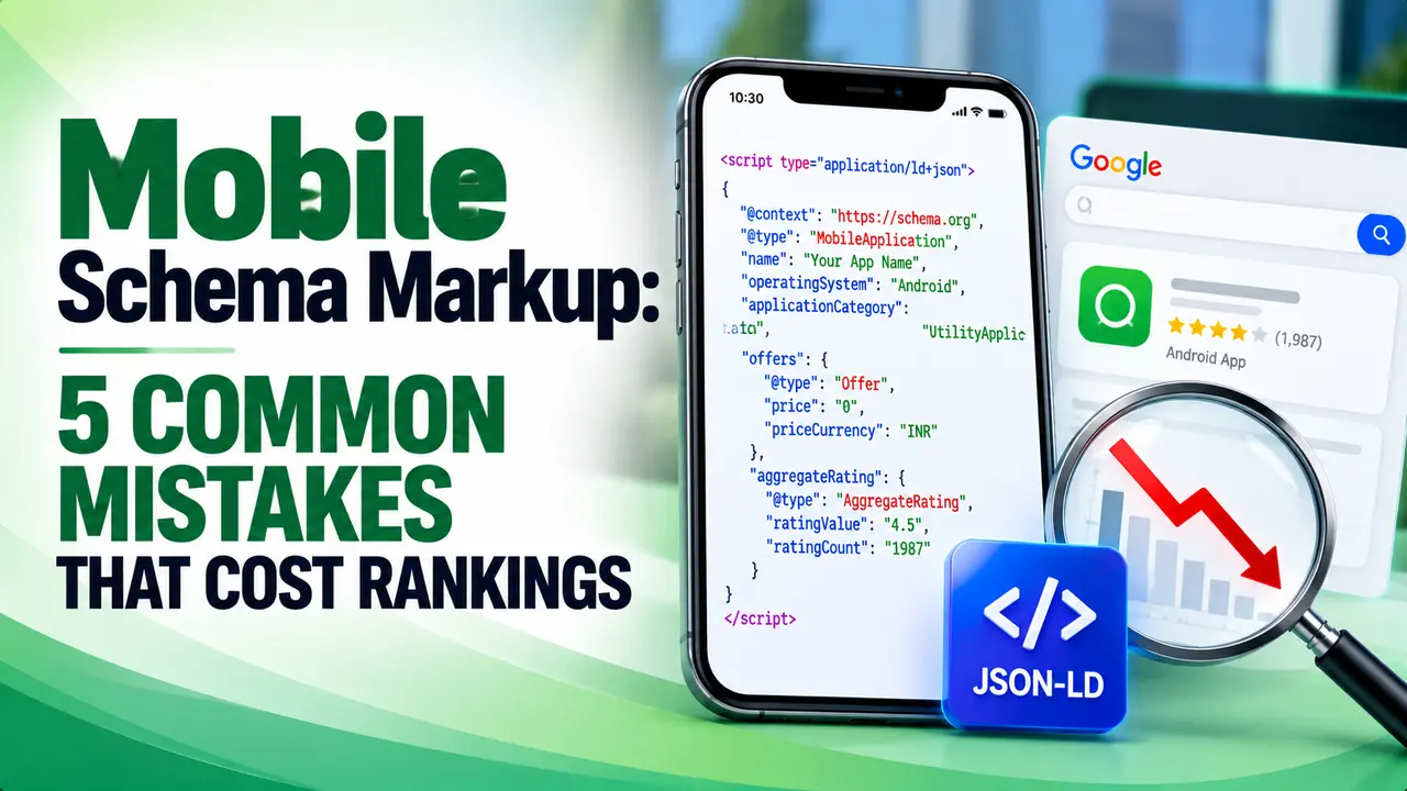
A page can pass the Rich Results Test on desktop and still lose its star ratings in search, because mobile schema markup never made it to the version Google is actually crawling. This guide walks through testing with Googlebot Smartphone and the fixes for responsive and separate mobile URLs.
Table of Contents
ToggleHey! If you have ever spent an afternoon tagging a page with careful JSON-LD only to watch the rich result never show up in search, this one is for you.
Picture this: your desktop page has flawless schema, your Rich Results Test passes, and your star ratings still will not render in search. The quiet reason is almost always mobile schema markup that never made it to the version Google is actually reading.
Why Mobile Schema Markup Decides What Google Actually Sees
Google has crawled and ranked the web using its smartphone agent, Googlebot Smartphone, for the vast majority of sites for years now. That single fact changes how structured data needs to be built and tested.
If your markup is missing, incomplete, or only present on the desktop version, it effectively does not exist for Google at all. The crawler never sees the desktop template, so any schema living only there is invisible to the index, no matter how correct it looks on a laptop.
That is the entire premise behind mobile schema markup as a discipline. You are writing structured data for a crawler that only ever experiences the mobile rendering of your page.
Google's own developer documentation puts it plainly when discussing readiness for mobile indexing: identical sets of structured data should be present on both versions of a site, and any URLs inside that structured data on the mobile version should already point to mobile friendly URLs.
Check One: Confirm Your Template Serves the Same Schema Everywhere
The single most common failure here is also the simplest to explain. A site built on two separate templates, one for phones and one for larger screens, writes the JSON-LD block into only one of them, usually the desktop template the dev team touched first.
Months later nobody remembers the gap exists, because the desktop preview still looks perfect and the markup still validates when someone pastes the desktop HTML into a checker.
Open your page source for the actual mobile rendering, not a resized desktop browser window, and search for the schema.org block by hand. If you cannot find it there, it is not there for Google either. You can learn more about how schema markup works in general if the concept is still new to your team.
For sites that still run on adaptive or dynamic serving rather than a single responsive template, this check matters even more, since the server actively decides what to send based on the requesting agent, and that logic can quietly drop a block it was never told to include.
Tip
Keep schema generation tied to the content itself rather than the template, so a single source of truth feeds both layouts and nothing can silently fall out of sync.
Check Two: Make Sure JavaScript Toggles Are Not Hiding Your Markup
Mobile layouts love collapsed sections. Reviews live behind a "read more" accordion, variants sit behind a tab, and long FAQ answers stay hidden until someone taps a plus icon to save vertical space.
None of that bothers a human visitor, but if the schema for that content only gets injected when the toggle fires a click event, a crawler that never clicks anything may finish rendering before that script runs.
Google renders almost all HTML pages it crawls using a modern browser engine, and it does eventually execute most client side JavaScript. The risk is that rendering is a second, delayed pass, and anything depending on a real user interaction, rather than page load, may never appear in what gets indexed.
If your mobile schema markup is written by a script that only fires after a toggle, a lazy load event, or an infinite scroll trigger, move that logic so the structured data is present in the initial HTML response instead, the same way your primary visible content should be.
A 2026 audit of five thousand live sites found that while 71 percent had deployed some form of schema markup, only 22 percent passed validation cleanly, meaning nearly half of all sites ship structured data that looks present but never actually qualifies for a rich result.
Check Three: Audit Responsive Breakpoints for Schema Gaps
A responsive site that serves one HTML document and one URL to every device sounds immune to parity problems, and in theory it mostly is. In practice, teams still manage to break this parity inside a responsive build.
The usual culprit is a component conditionally removed from the DOM below a certain viewport width, for example a sidebar author box, a breadcrumb trail, or a review summary widget. If schema was attached to that component rather than rendered independently, trimming it for small screens trims the markup along with it.
Another version of the same mistake happens with image schema. Google's guidance is specific that structured data should be identical on both versions of your site, including matching image URLs rather than swapping in a smaller mobile image the desktop markup never references.
Run your page through a few common breakpoints, not just one, and confirm visually that nothing tied to your schema disappears along the way. A browser's device toolbar is enough for a first pass before formal validation.
Check Four: Validate With the Rich Results Test On Both Agents
Guessing is not a strategy here. Google's Rich Results Test is the real, documented way to see exactly what Googlebot Smartphone parses from a URL, because it lets you choose which crawler agent runs the test.
Support documentation for the tool notes that the default user agent is smartphone, since that is how most users browse the web today, but you can switch to the desktop agent and compare results for the same URL.
When Google added that agent selector, reporting at the time explained the point clearly: the update exists to help site owners review their structured data implementation using both user agents rather than assuming one result applies to every device.
Coverage of that rollout noted the change specifically targets sites maintaining separate templates, since responsive sites face fewer parity concerns, though testing both remains worthwhile for everyone. Run both agents and treat any difference as a bug to fix, not a quirk to ignore.
Check Five: Watch Search Console for Mobile Usability and Markup Errors
A one time validation pass only tells you the state of a page today. Search Console gives you an ongoing view of what Google keeps finding on the pages it actually recrawls, which is where slow drift in mobile schema markup tends to surface first.
The Enhancements section reports structured data types separately and will flag a sudden drop in valid items for a type that used to validate fine, often the first sign a template change broke something only on mobile. If you are not sure how to read those reports, our guide on how to fix mobile usability issues in Search Console walks through the panel in detail.
It is also worth understanding how Google renders JavaScript pages, since a dependency on a slow or late script is a frequent root cause of missing mobile schema markup. Independent analysis of Googlebot's rendering behavior found that Google attempts to render the overwhelming majority of HTML pages it crawls, but that rendering happens as a distinct, sometimes delayed pass after the initial crawl.
Set a recurring weekly reminder to skim the Enhancements reports rather than waiting for rankings to drop before you notice a problem.
Tip
Bookmark the URL Inspection tool alongside the Rich Results Test. Inspecting a live URL shows you the actual rendered HTML Google stored for that page, which is the fastest way to confirm whether your mobile schema markup survived the render.
Common Mistakes That Quietly Break Mobile Schema Markup
Most parity problems trace back to a short list of repeat offenders. Treat the list below as a quick audit checklist the next time you suspect your mobile schema markup is not behaving the way the desktop version suggests it should.
JSON-LD block by hand rather than trusting a desktop preview.None of these fixes require a redesign. Most are a single conditional in a template file, but they only get fixed once someone is actually looking for these gaps instead of assuming parity by default.
Responsive design remains the simplest long term insurance against this category of bug, since one URL and one HTML document for every device removes most places a gap could hide. Guidance from Semrush's mobile research echoes this, noting that pages using Article, HowTo, or FAQ schema are substantially more likely to be cited by large language model tools, reinforcing how much is at stake when that markup fails to reach the version Google indexes. If your site still runs separate mobile URLs, our breakdown of how mobile indexing actually works is a useful next read.
Mobile schema markup is simply the structured data, usually written as JSON-LD, that is present and parsable on the version of a page served to a mobile device and to Googlebot Smartphone, as opposed to markup that only exists on a desktop template.
Because Google's crawler almost always sees the mobile version of a page for ranking and indexing purposes. If the markup lives exclusively on a desktop template that crawler never requests, it is never read, parsed, or used, so it has no effect on rich results at all.
Use the Rich Results Test and explicitly select the smartphone user agent rather than relying on the default result, then compare it against the same test run with the desktop agent. A difference between the two reports is your clearest signal of a parity problem.
Yes. Responsive design removes the risk of two separate templates, but components that get conditionally hidden or removed below certain screen widths can still take their attached schema with them, so testing is still worthwhile even on a fully responsive build.
Google Search Console's Enhancements reports track structured data validity over time and will flag a drop in valid items whenever a template or script change breaks something, making it the most reliable ongoing early warning system.
Learn Today
Googlebot Smartphone
The crawler agent Google uses to render and index the overwhelming majority of websites today.
Schema Parity
The requirement that structured data on a mobile page matches the structured data on its desktop counterpart exactly.
JSON-LD
The script based format most sites use to embed schema.org structured data inside a page without touching visible HTML.
Rich Results Test
Google's free tool for validating structured data and previewing eligibility for enhanced search listings.
Adaptive Serving
A setup where a server returns different HTML for the same URL depending on the requesting device's user agent.
Rendering Pass
The stage after the initial crawl where Google executes JavaScript to see the fully loaded version of a page.
Related Articles
Give Your Mobile Schema Markup a Real Audit This Week
Explore more Brandella Journal guides on SEO and digital marketing.
Related Posts
SEO2 months ago
Mobile First Indexing Explained

Mobile SEO2 months ago
Mobile UX Best Practices for SEO
Previous Post
Next Post
Previous Post
Next Post




- Artificial Intelligence
- Content
- Core Web Vitals
- Development
- Digital Marketing
- Display Advertising
- Google Ads
- Google Search Console
- GTM
- HTML
- HTML CSS
- JavaScript
- Keyword Research
- Link Building
- LinkedIn Ads
- Local SEO
- Meta Ads
- Mobile SEO
- Off-Page SEO
- On-Page SEO
- Paid Media
- Paid Media Analytics
- PHP
- PPC Strategy
- Python
- SEO
- SEO Basics
- SEO Tools
- Social
- Technical SEO