

- Home
- SEODiscover the latest updates from across the United States, including politics, culture, economy, and trending stories. Stay informed on the key events shaping the nation and the topics everyone’s talking about.
- Technical SEOLearn technical SEO concepts including crawling, indexing, XML sitemaps, robots.txt, canonical tags, site architecture, and website performance.
- Local SEOOptimize your business for local seo with Google Business Profile, local citations, reviews, maps, and location-based SEO.
- Mobile SEOImprove your website’s mobile seo performance with responsive design, mobile-first indexing, usability, and page speed optimization.
- On-Page SEOExplore on-page seo optimization techniques such as title tags, meta descriptions, headings, URLs, internal linking, and content optimization.
- Off-Page SEODiscover off-page SEO strategies such as backlinks, digital PR, brand mentions, outreach, and authority building.
- SEO ToolsExplore the best SEO tools for keyword research, technical audits, backlink analysis, rank tracking, and website optimization.
- Core Web VitalsLearn how to improve Core Web Vitals including LCP, INP, CLS, page speed, and overall user experience for better rankings.
- Keyword ResearchLearn how to find profitable keywords, analyze search intent, evaluate competition, and build effective keyword strategies.
- Link BuildingMaster ethical link building techniques, backlink analysis, outreach methods, guest posting, and authority growth strategies.
- Google Search ConsoleLearn how to use Google Search Console to monitor indexing, fix errors, analyze search performance, and improve SEO.
- SEO BasicsLearn the fundamentals of search engine optimization (SEO Basics), including how search engines work, SEO terminology, and beginner-friendly best practices.
- Paid Media
- Display AdvertisingLearn display advertising strategies, banner ads, audience targeting, remarketing, Google Display campaigns, and optimization techniques.
- Google AdsLearn Google Ads strategies, campaign setup, bidding, keywords, Performance Max, Search Ads, and optimization techniques.
- LinkedIn AdsLearn LinkedIn Ads strategies for B2B marketing, lead generation, audience targeting, campaign optimization, and paid social advertising.
- Meta AdsLearn Meta Ads strategies for Facebook and Instagram, including campaign setup, targeting, retargeting, and performance optimization.
- Paid Media AnalyticsLearn paid media analytics, including CPC, CTR, CPA, ROAS, conversion tracking, attribution, reporting, and campaign performance analysis.
- PPC StrategyLearn effective PPC strategies, campaign planning, bidding, keyword targeting, landing pages, conversion optimization, and more.
- ContentTransform your living spaces with inspiration, tips, and trends in interior design. From minimalist decor to bold statements, find ideas for every style and budget.
- Social
- Digital MarketingExplore stories and advice on living your best life. From personal growth to entertainment, dive into the latest in lifestyle trends and inspiration.
- Artificial IntelligenceStay informed about health and wellness with expert advice, fitness tips, and the latest medical breakthroughs. Your guide to a healthier and happier life.
- DevelopmentYou will find development related educational articles
- GTMLearn Google Tag Manager (GTM) with practical guides for tags, triggers, variables, tracking, conversions, and website analytics implementation.
- HTMLLearn HTML with simple tutorials, examples, tags, elements, attributes, and best practices for building modern web pages.
- HTML CSSLearn HTML CSS together with practical tutorials, examples, layouts, styling techniques, responsive design, and modern web development practices.
- HTML JSLearn HTML JS – JavaScript with practical tutorials and examples for adding interactivity, dynamic content, events, and functionality to web pages.
- JavaScriptExplore JavaScript tutorials, examples, concepts, and practical techniques for creating interactive and dynamic websites and web applications.
- PHPLearn PHP programming with practical tutorials, examples, functions, syntax, and web development techniques for beginners and developers.
- PythonLearn Python programming with practical tutorials, examples, syntax, functions, automation techniques, and useful programming concepts.
- Home
- SEODiscover the latest updates from across the United States, including politics, culture, economy, and trending stories. Stay informed on the key events shaping the nation and the topics everyone’s talking about.
- Technical SEOLearn technical SEO concepts including crawling, indexing, XML sitemaps, robots.txt, canonical tags, site architecture, and website performance.
- Local SEOOptimize your business for local seo with Google Business Profile, local citations, reviews, maps, and location-based SEO.
- Mobile SEOImprove your website’s mobile seo performance with responsive design, mobile-first indexing, usability, and page speed optimization.
- On-Page SEOExplore on-page seo optimization techniques such as title tags, meta descriptions, headings, URLs, internal linking, and content optimization.
- Off-Page SEODiscover off-page SEO strategies such as backlinks, digital PR, brand mentions, outreach, and authority building.
- SEO ToolsExplore the best SEO tools for keyword research, technical audits, backlink analysis, rank tracking, and website optimization.
- Core Web VitalsLearn how to improve Core Web Vitals including LCP, INP, CLS, page speed, and overall user experience for better rankings.
- Keyword ResearchLearn how to find profitable keywords, analyze search intent, evaluate competition, and build effective keyword strategies.
- Link BuildingMaster ethical link building techniques, backlink analysis, outreach methods, guest posting, and authority growth strategies.
- Google Search ConsoleLearn how to use Google Search Console to monitor indexing, fix errors, analyze search performance, and improve SEO.
- SEO BasicsLearn the fundamentals of search engine optimization (SEO Basics), including how search engines work, SEO terminology, and beginner-friendly best practices.
- Paid Media
- Display AdvertisingLearn display advertising strategies, banner ads, audience targeting, remarketing, Google Display campaigns, and optimization techniques.
- Google AdsLearn Google Ads strategies, campaign setup, bidding, keywords, Performance Max, Search Ads, and optimization techniques.
- LinkedIn AdsLearn LinkedIn Ads strategies for B2B marketing, lead generation, audience targeting, campaign optimization, and paid social advertising.
- Meta AdsLearn Meta Ads strategies for Facebook and Instagram, including campaign setup, targeting, retargeting, and performance optimization.
- Paid Media AnalyticsLearn paid media analytics, including CPC, CTR, CPA, ROAS, conversion tracking, attribution, reporting, and campaign performance analysis.
- PPC StrategyLearn effective PPC strategies, campaign planning, bidding, keyword targeting, landing pages, conversion optimization, and more.
- ContentTransform your living spaces with inspiration, tips, and trends in interior design. From minimalist decor to bold statements, find ideas for every style and budget.
- Social
- Digital MarketingExplore stories and advice on living your best life. From personal growth to entertainment, dive into the latest in lifestyle trends and inspiration.
- Artificial IntelligenceStay informed about health and wellness with expert advice, fitness tips, and the latest medical breakthroughs. Your guide to a healthier and happier life.
- DevelopmentYou will find development related educational articles
- GTMLearn Google Tag Manager (GTM) with practical guides for tags, triggers, variables, tracking, conversions, and website analytics implementation.
- HTMLLearn HTML with simple tutorials, examples, tags, elements, attributes, and best practices for building modern web pages.
- HTML CSSLearn HTML CSS together with practical tutorials, examples, layouts, styling techniques, responsive design, and modern web development practices.
- HTML JSLearn HTML JS – JavaScript with practical tutorials and examples for adding interactivity, dynamic content, events, and functionality to web pages.
- JavaScriptExplore JavaScript tutorials, examples, concepts, and practical techniques for creating interactive and dynamic websites and web applications.
- PHPLearn PHP programming with practical tutorials, examples, functions, syntax, and web development techniques for beginners and developers.
- PythonLearn Python programming with practical tutorials, examples, syntax, functions, automation techniques, and useful programming concepts.
Now Reading: Common Mobile SEO Mistakes to Avoid in 2026
-
01
Common Mobile SEO Mistakes to Avoid in 2026
- Home//
- SEO//Discover the latest updates from across the United States, including politics, culture, economy, and trending stories. Stay informed on the key events shaping the nation and the topics everyone’s talking about.
- Technical SEO//Learn technical SEO concepts including crawling, indexing, XML sitemaps, robots.txt, canonical tags, site architecture, and website performance.
- Local SEO//Optimize your business for local seo with Google Business Profile, local citations, reviews, maps, and location-based SEO.
- Mobile SEO//Improve your website’s mobile seo performance with responsive design, mobile-first indexing, usability, and page speed optimization.
- On-Page SEO//Explore on-page seo optimization techniques such as title tags, meta descriptions, headings, URLs, internal linking, and content optimization.
- Off-Page SEO//Discover off-page SEO strategies such as backlinks, digital PR, brand mentions, outreach, and authority building.
- SEO Tools//Explore the best SEO tools for keyword research, technical audits, backlink analysis, rank tracking, and website optimization.
- Core Web Vitals//Learn how to improve Core Web Vitals including LCP, INP, CLS, page speed, and overall user experience for better rankings.
- Keyword Research//Learn how to find profitable keywords, analyze search intent, evaluate competition, and build effective keyword strategies.
- Link Building//Master ethical link building techniques, backlink analysis, outreach methods, guest posting, and authority growth strategies.
- Google Search Console//Learn how to use Google Search Console to monitor indexing, fix errors, analyze search performance, and improve SEO.
- SEO Basics//Learn the fundamentals of search engine optimization (SEO Basics), including how search engines work, SEO terminology, and beginner-friendly best practices.
- Paid Media//
- Display Advertising//Learn display advertising strategies, banner ads, audience targeting, remarketing, Google Display campaigns, and optimization techniques.
- Google Ads//Learn Google Ads strategies, campaign setup, bidding, keywords, Performance Max, Search Ads, and optimization techniques.
- LinkedIn Ads//Learn LinkedIn Ads strategies for B2B marketing, lead generation, audience targeting, campaign optimization, and paid social advertising.
- Meta Ads//Learn Meta Ads strategies for Facebook and Instagram, including campaign setup, targeting, retargeting, and performance optimization.
- Paid Media Analytics//Learn paid media analytics, including CPC, CTR, CPA, ROAS, conversion tracking, attribution, reporting, and campaign performance analysis.
- PPC Strategy//Learn effective PPC strategies, campaign planning, bidding, keyword targeting, landing pages, conversion optimization, and more.
- Content//Transform your living spaces with inspiration, tips, and trends in interior design. From minimalist decor to bold statements, find ideas for every style and budget.
- Social//
- Digital Marketing//Explore stories and advice on living your best life. From personal growth to entertainment, dive into the latest in lifestyle trends and inspiration.
- Artificial Intelligence//Stay informed about health and wellness with expert advice, fitness tips, and the latest medical breakthroughs. Your guide to a healthier and happier life.
- Development//You will find development related educational articles
- GTM//Learn Google Tag Manager (GTM) with practical guides for tags, triggers, variables, tracking, conversions, and website analytics implementation.
- HTML//Learn HTML with simple tutorials, examples, tags, elements, attributes, and best practices for building modern web pages.
- HTML CSS//Learn HTML CSS together with practical tutorials, examples, layouts, styling techniques, responsive design, and modern web development practices.
- HTML JS//Learn HTML JS – JavaScript with practical tutorials and examples for adding interactivity, dynamic content, events, and functionality to web pages.
- JavaScript//Explore JavaScript tutorials, examples, concepts, and practical techniques for creating interactive and dynamic websites and web applications.
- PHP//Learn PHP programming with practical tutorials, examples, functions, syntax, and web development techniques for beginners and developers.
- Python//Learn Python programming with practical tutorials, examples, syntax, functions, automation techniques, and useful programming concepts.
Common Mobile SEO Mistakes to Avoid in 2026

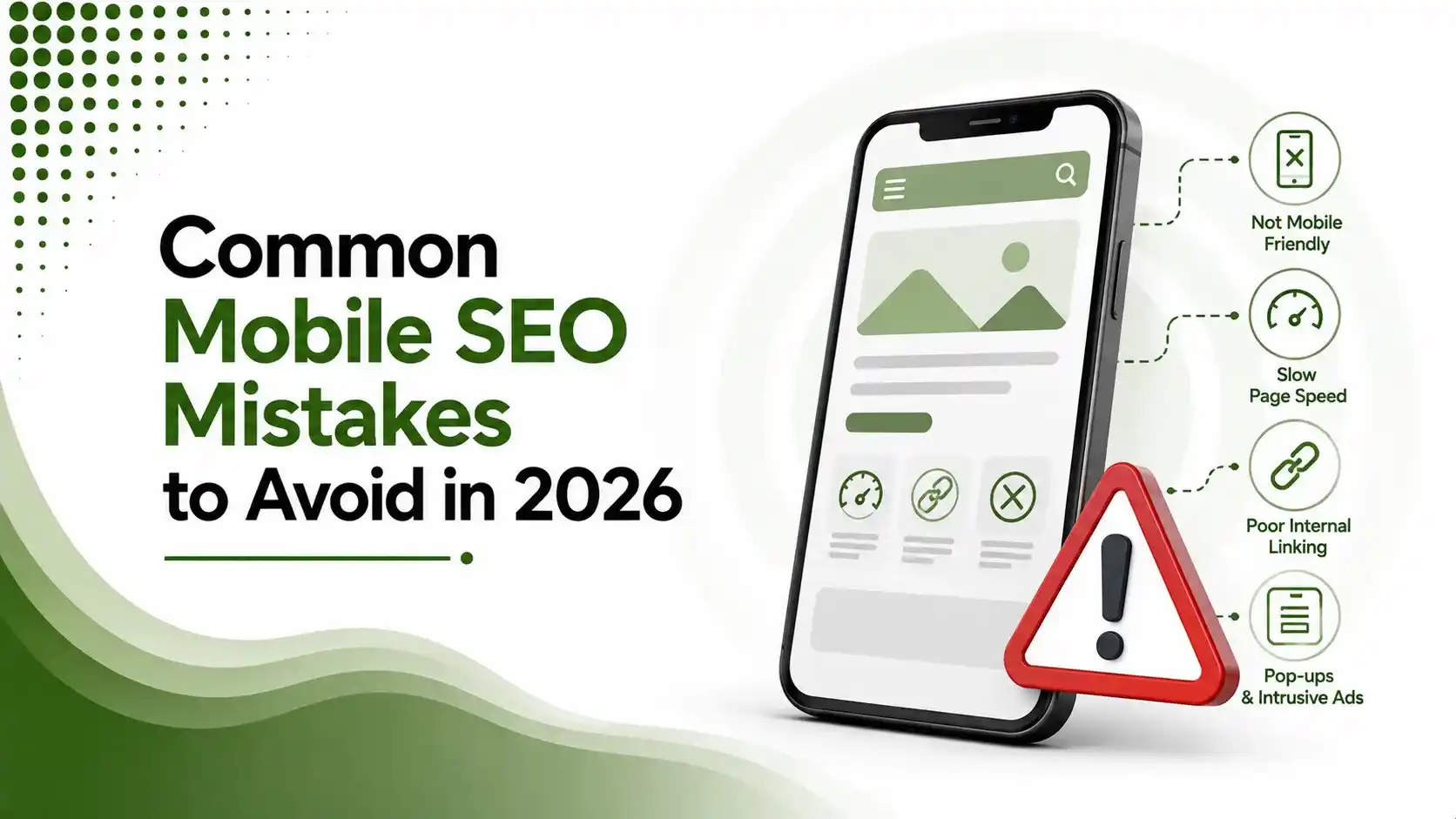
Even small mobile SEO mistakes can hurt your search rankings and user experience. This guide highlights the most common errors website owners make and provides practical solutions to improve mobile performance, Core Web Vitals, indexing, and responsive design for better organic visibility in 2026.
Table of Contents
Toggle64% of websites still fail to meet Google's Core Web Vitals thresholds across all three metrics, according to HTTP Archive's Web Almanac. That number hasn't moved much in years, which tells you something important: these aren't obscure, hard-to-find problems. They're the same handful of mobile SEO mistakes, repeated across millions of sites, quietly capping rankings that would otherwise be fine.
We've already covered what to actually build in our mobile SEO checklist and how to fix mobile page speed. This article flips the lens: the specific mistakes that undo good work elsewhere, the ones that show up again and again in real audits.
Some of these are obvious once pointed out. Others are subtle enough that a site can look completely fine to a human visitor while quietly failing for Google's mobile crawler in the background.
None of these require a rebuild to fix. Most are a single configuration change, a redirect rule, or a CSS audit away from being resolved entirely.
01Broken Mobile Redirects
Redirecting to the Homepage Instead of the Matching Page
Sites still running separate m.dot mobile URLs sometimes redirect every mobile visitor to the homepage rather than the equivalent mobile page, breaking the experience for anyone arriving from a deep search result.
Blocking CSS or JavaScript in Robots.txt
According to The Crawl Theory's guide to SEO mistakes that actually move rankings, blocking rendering-critical resources prevents Googlebot from seeing the page the way a real visitor does, directly harming how mobile pages get evaluated.
# A robots.txt mistake that silently breaks mobile rendering
User-agent: *
Disallow: /assets/css/
Disallow: /assets/js/

# Correct: allow rendering-critical resources through
User-agent: *
Allow: /assets/
Blocking these folders means Googlebot can't render the mobile layout correctly at all
02Intrusive Interstitials
A full-screen pop-up covering the main content immediately after a visitor taps through from search results is directly penalized under Google's mobile page experience guidelines. This isn't a minor UX complaint; it's an explicit ranking factor.
03Misconfigured Viewport Meta Tag
A missing or incorrect viewport tag forces mobile browsers to render the page at desktop width, requiring visitors to pinch and zoom to read anything at all.
<!-- Correct viewport configuration for responsive mobile rendering -->
<meta name="viewport" content="width=device-width, initial-scale=1">
Without this exact tag, mobile browsers default to a desktop-width render
04Priority Mistake Checker, Tap to Explore
Six mistakes appear repeatedly across real mobile SEO audits. Tap each to see the fix.
Content Parity Gaps
Sections hidden on mobile via display:none, including headings and structured data, are simply not indexed. Audit mobile CSS against the desktop version directly.
05Ignoring Local Mobile Search Behavior
According to Content Whale's guide to SEO mistakes and common errors in 2026, 88% of consumers who perform local searches on smartphones visit or call a business within 24 hours, making mobile local optimization a direct revenue factor, not just a technical checkbox.
06Treating Mobile SEO as a One-Time Project
According to SEO.com's guide to the top SEO mistakes to avoid in 2026, businesses that undervalue ongoing mobile optimization, treating it as a launch-day task rather than a maintained standard, tend to see the same issues quietly reappear after redesigns or new feature launches.
| Mistake | Why It's Missed So Often |
|---|---|
| Broken mobile redirects | Works fine when tested from the homepage, breaks on deep links |
| Blocked CSS/JS in robots.txt | Invisible unless specifically checked via URL Inspection |
| Intrusive interstitials | Marketing adds them without technical SEO review |
| Content parity gaps | Looks correct visually; only breaks in the indexed HTML |
07Skipping the Mobile-Friendly Test
According to Absolute Websites' guide to common SEO and web design mistakes for 2026, running Google's own Mobile-Friendly Test before and after any redesign catches usability regressions before they reach production and affect rankings.
08Unplayable or Unsupported Content Types
According to Red Rattler Creative's guide to SEO mistakes costing traffic and rankings, embedded video or interactive elements relying on formats unsupported by mobile browsers fail silently, showing a blank space where content should be.
Testing every embedded element directly on an actual phone, rather than assuming desktop testing covers it, catches this category of mobile SEO mistakes before visitors ever encounter them.
09Ignoring Search Console's Mobile Reports
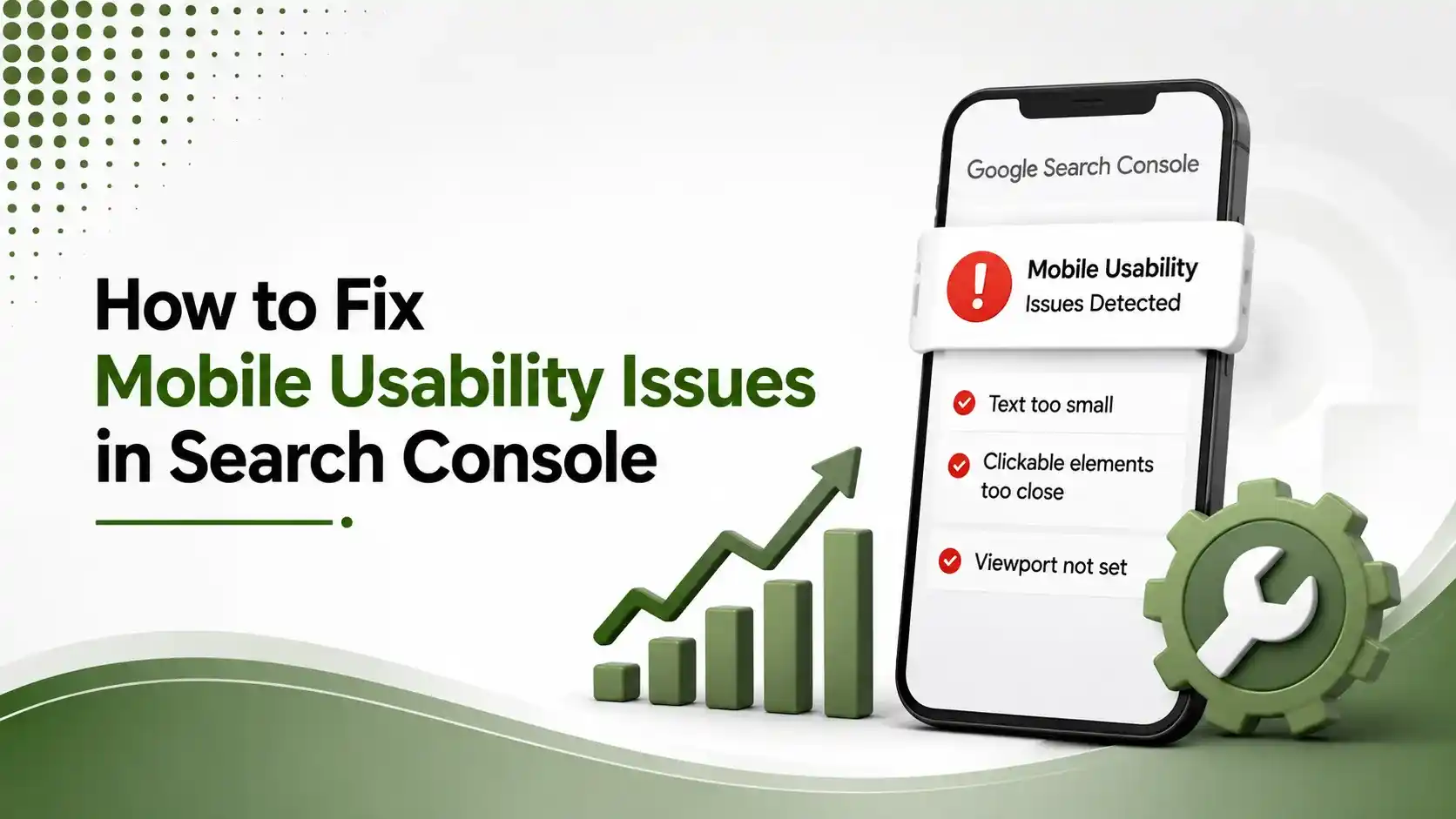
According to Digikestra's guide to common SEO mistakes hurting rankings in 2026, Search Console flags real, specific mobile usability problems Google has already detected on live pages, yet many site owners never check that report until traffic has visibly dropped.
Reviewing this report monthly, rather than reactively after a ranking decline, catches these mobile SEO mistakes while they're still small, isolated issues rather than site-wide patterns.
10Building a Prevention Habit
According to Nation Media's guide to common SEO mistakes to avoid in 2026, most of these mobile SEO mistakes aren't one-time errors; they're recurring patterns that resurface every time a site gets redesigned, migrated, or handed to a new developer without documentation.
Maintaining a simple internal checklist, reviewed before any major site change ships, catches these mobile SEO mistakes before they reach production rather than after rankings have already started to slip.
According to Bora Agency's guide to SEO mistakes that kill Google rankings in 2026, clean structure, fast load times, proper indexing, and mobile usability remain baseline requirements, not advanced optimization, for any site expecting to compete in 2026 search results.
11FAQs on Mobile SEO Mistakes
Content parity gaps, where sections visible on desktop are hidden via display:none on mobile, remain one of the most frequent and damaging mistakes, since hidden content simply isn't indexed.
Full-screen pop-ups covering content immediately after a search result tap are directly penalized. Smaller banners, legal notices, and reasonably sized interstitials generally are not affected.
Use Search Console's URL Inspection tool to view the rendered page and compare it against the live version. Blocked resources will show as missing or broken in the render.
Google's guidelines recommend at least 48 pixels of tappable space per target, with adequate spacing between adjacent buttons or links to avoid accidental taps.
After every redesign or major feature launch at minimum, plus a routine quarterly check using Search Console's Mobile Usability report and Google's Mobile-Friendly Test.
Related Articles
What We Learn Today
64% of sites fail all three Core Web Vitals thresholds
Redirect mobile URLs to matching pages, never the homepage
Blocked CSS/JS in robots.txt breaks how Google renders mobile pages
Full-screen interstitials after a search tap are directly penalized
88% of local mobile searchers visit or call within 24 hours
Mobile SEO needs ongoing maintenance, not a one-time launch fix
Turn These Fixes Into a Repeatable Process
Avoiding mistakes is only half the job. Pair this guide with our full mobile SEO checklist and page speed guide to build a genuinely complete, ongoing mobile optimization routine.
Related Posts

Previous Post
Next Post




- Artificial Intelligence
- Content
- Core Web Vitals
- Development
- Digital Marketing
- Display Advertising
- Google Ads
- Google Search Console
- GTM
- HTML
- HTML CSS
- JavaScript
- Keyword Research
- Link Building
- LinkedIn Ads
- Local SEO
- Meta Ads
- Mobile SEO
- Off-Page SEO
- On-Page SEO
- Paid Media
- Paid Media Analytics
- PHP
- PPC Strategy
- Python
- SEO
- SEO Basics
- SEO Tools
- Social
- Technical SEO