
- Home
- SEODiscover the latest updates from across the United States, including politics, culture, economy, and trending stories. Stay informed on the key events shaping the nation and the topics everyone’s talking about.
- Technical SEOLearn technical SEO concepts including crawling, indexing, XML sitemaps, robots.txt, canonical tags, site architecture, and website performance.
- Local SEOOptimize your business for local seo with Google Business Profile, local citations, reviews, maps, and location-based SEO.
- Mobile SEOImprove your website’s mobile seo performance with responsive design, mobile-first indexing, usability, and page speed optimization.
- On-Page SEOExplore on-page seo optimization techniques such as title tags, meta descriptions, headings, URLs, internal linking, and content optimization.
- Off-Page SEODiscover off-page SEO strategies such as backlinks, digital PR, brand mentions, outreach, and authority building.
- SEO ToolsExplore the best SEO tools for keyword research, technical audits, backlink analysis, rank tracking, and website optimization.
- Core Web VitalsLearn how to improve Core Web Vitals including LCP, INP, CLS, page speed, and overall user experience for better rankings.
- Keyword ResearchLearn how to find profitable keywords, analyze search intent, evaluate competition, and build effective keyword strategies.
- Link BuildingMaster ethical link building techniques, backlink analysis, outreach methods, guest posting, and authority growth strategies.
- Google Search ConsoleLearn how to use Google Search Console to monitor indexing, fix errors, analyze search performance, and improve SEO.
- SEO BasicsLearn the fundamentals of search engine optimization (SEO Basics), including how search engines work, SEO terminology, and beginner-friendly best practices.
- Paid Media
- Display AdvertisingLearn display advertising strategies, banner ads, audience targeting, remarketing, Google Display campaigns, and optimization techniques.
- Google AdsLearn Google Ads strategies, campaign setup, bidding, keywords, Performance Max, Search Ads, and optimization techniques.
- LinkedIn AdsLearn LinkedIn Ads strategies for B2B marketing, lead generation, audience targeting, campaign optimization, and paid social advertising.
- Meta AdsLearn Meta Ads strategies for Facebook and Instagram, including campaign setup, targeting, retargeting, and performance optimization.
- Paid Media AnalyticsLearn paid media analytics, including CPC, CTR, CPA, ROAS, conversion tracking, attribution, reporting, and campaign performance analysis.
- PPC StrategyLearn effective PPC strategies, campaign planning, bidding, keyword targeting, landing pages, conversion optimization, and more.
- ContentTransform your living spaces with inspiration, tips, and trends in interior design. From minimalist decor to bold statements, find ideas for every style and budget.
- Social
- Digital MarketingExplore stories and advice on living your best life. From personal growth to entertainment, dive into the latest in lifestyle trends and inspiration.
- Artificial IntelligenceStay informed about health and wellness with expert advice, fitness tips, and the latest medical breakthroughs. Your guide to a healthier and happier life.
- DevelopmentYou will find development related educational articles
- GTMLearn Google Tag Manager (GTM) with practical guides for tags, triggers, variables, tracking, conversions, and website analytics implementation.
- HTMLLearn HTML with simple tutorials, examples, tags, elements, attributes, and best practices for building modern web pages.
- HTML CSSLearn HTML CSS together with practical tutorials, examples, layouts, styling techniques, responsive design, and modern web development practices.
- HTML JSLearn HTML JS – JavaScript with practical tutorials and examples for adding interactivity, dynamic content, events, and functionality to web pages.
- JavaScriptExplore JavaScript tutorials, examples, concepts, and practical techniques for creating interactive and dynamic websites and web applications.
- PHPLearn PHP programming with practical tutorials, examples, functions, syntax, and web development techniques for beginners and developers.
- PythonLearn Python programming with practical tutorials, examples, syntax, functions, automation techniques, and useful programming concepts.
- Home
- SEODiscover the latest updates from across the United States, including politics, culture, economy, and trending stories. Stay informed on the key events shaping the nation and the topics everyone’s talking about.
- Technical SEOLearn technical SEO concepts including crawling, indexing, XML sitemaps, robots.txt, canonical tags, site architecture, and website performance.
- Local SEOOptimize your business for local seo with Google Business Profile, local citations, reviews, maps, and location-based SEO.
- Mobile SEOImprove your website’s mobile seo performance with responsive design, mobile-first indexing, usability, and page speed optimization.
- On-Page SEOExplore on-page seo optimization techniques such as title tags, meta descriptions, headings, URLs, internal linking, and content optimization.
- Off-Page SEODiscover off-page SEO strategies such as backlinks, digital PR, brand mentions, outreach, and authority building.
- SEO ToolsExplore the best SEO tools for keyword research, technical audits, backlink analysis, rank tracking, and website optimization.
- Core Web VitalsLearn how to improve Core Web Vitals including LCP, INP, CLS, page speed, and overall user experience for better rankings.
- Keyword ResearchLearn how to find profitable keywords, analyze search intent, evaluate competition, and build effective keyword strategies.
- Link BuildingMaster ethical link building techniques, backlink analysis, outreach methods, guest posting, and authority growth strategies.
- Google Search ConsoleLearn how to use Google Search Console to monitor indexing, fix errors, analyze search performance, and improve SEO.
- SEO BasicsLearn the fundamentals of search engine optimization (SEO Basics), including how search engines work, SEO terminology, and beginner-friendly best practices.
- Paid Media
- Display AdvertisingLearn display advertising strategies, banner ads, audience targeting, remarketing, Google Display campaigns, and optimization techniques.
- Google AdsLearn Google Ads strategies, campaign setup, bidding, keywords, Performance Max, Search Ads, and optimization techniques.
- LinkedIn AdsLearn LinkedIn Ads strategies for B2B marketing, lead generation, audience targeting, campaign optimization, and paid social advertising.
- Meta AdsLearn Meta Ads strategies for Facebook and Instagram, including campaign setup, targeting, retargeting, and performance optimization.
- Paid Media AnalyticsLearn paid media analytics, including CPC, CTR, CPA, ROAS, conversion tracking, attribution, reporting, and campaign performance analysis.
- PPC StrategyLearn effective PPC strategies, campaign planning, bidding, keyword targeting, landing pages, conversion optimization, and more.
- ContentTransform your living spaces with inspiration, tips, and trends in interior design. From minimalist decor to bold statements, find ideas for every style and budget.
- Social
- Digital MarketingExplore stories and advice on living your best life. From personal growth to entertainment, dive into the latest in lifestyle trends and inspiration.
- Artificial IntelligenceStay informed about health and wellness with expert advice, fitness tips, and the latest medical breakthroughs. Your guide to a healthier and happier life.
- DevelopmentYou will find development related educational articles
- GTMLearn Google Tag Manager (GTM) with practical guides for tags, triggers, variables, tracking, conversions, and website analytics implementation.
- HTMLLearn HTML with simple tutorials, examples, tags, elements, attributes, and best practices for building modern web pages.
- HTML CSSLearn HTML CSS together with practical tutorials, examples, layouts, styling techniques, responsive design, and modern web development practices.
- HTML JSLearn HTML JS – JavaScript with practical tutorials and examples for adding interactivity, dynamic content, events, and functionality to web pages.
- JavaScriptExplore JavaScript tutorials, examples, concepts, and practical techniques for creating interactive and dynamic websites and web applications.
- PHPLearn PHP programming with practical tutorials, examples, functions, syntax, and web development techniques for beginners and developers.
- PythonLearn Python programming with practical tutorials, examples, syntax, functions, automation techniques, and useful programming concepts.
Now Reading: How to Test Mobile Friendliness of a Website
-
01
How to Test Mobile Friendliness of a Website
- Home//
- SEO//Discover the latest updates from across the United States, including politics, culture, economy, and trending stories. Stay informed on the key events shaping the nation and the topics everyone’s talking about.
- Technical SEO//Learn technical SEO concepts including crawling, indexing, XML sitemaps, robots.txt, canonical tags, site architecture, and website performance.
- Local SEO//Optimize your business for local seo with Google Business Profile, local citations, reviews, maps, and location-based SEO.
- Mobile SEO//Improve your website’s mobile seo performance with responsive design, mobile-first indexing, usability, and page speed optimization.
- On-Page SEO//Explore on-page seo optimization techniques such as title tags, meta descriptions, headings, URLs, internal linking, and content optimization.
- Off-Page SEO//Discover off-page SEO strategies such as backlinks, digital PR, brand mentions, outreach, and authority building.
- SEO Tools//Explore the best SEO tools for keyword research, technical audits, backlink analysis, rank tracking, and website optimization.
- Core Web Vitals//Learn how to improve Core Web Vitals including LCP, INP, CLS, page speed, and overall user experience for better rankings.
- Keyword Research//Learn how to find profitable keywords, analyze search intent, evaluate competition, and build effective keyword strategies.
- Link Building//Master ethical link building techniques, backlink analysis, outreach methods, guest posting, and authority growth strategies.
- Google Search Console//Learn how to use Google Search Console to monitor indexing, fix errors, analyze search performance, and improve SEO.
- SEO Basics//Learn the fundamentals of search engine optimization (SEO Basics), including how search engines work, SEO terminology, and beginner-friendly best practices.
- Paid Media//
- Display Advertising//Learn display advertising strategies, banner ads, audience targeting, remarketing, Google Display campaigns, and optimization techniques.
- Google Ads//Learn Google Ads strategies, campaign setup, bidding, keywords, Performance Max, Search Ads, and optimization techniques.
- LinkedIn Ads//Learn LinkedIn Ads strategies for B2B marketing, lead generation, audience targeting, campaign optimization, and paid social advertising.
- Meta Ads//Learn Meta Ads strategies for Facebook and Instagram, including campaign setup, targeting, retargeting, and performance optimization.
- Paid Media Analytics//Learn paid media analytics, including CPC, CTR, CPA, ROAS, conversion tracking, attribution, reporting, and campaign performance analysis.
- PPC Strategy//Learn effective PPC strategies, campaign planning, bidding, keyword targeting, landing pages, conversion optimization, and more.
- Content//Transform your living spaces with inspiration, tips, and trends in interior design. From minimalist decor to bold statements, find ideas for every style and budget.
- Social//
- Digital Marketing//Explore stories and advice on living your best life. From personal growth to entertainment, dive into the latest in lifestyle trends and inspiration.
- Artificial Intelligence//Stay informed about health and wellness with expert advice, fitness tips, and the latest medical breakthroughs. Your guide to a healthier and happier life.
- Development//You will find development related educational articles
- GTM//Learn Google Tag Manager (GTM) with practical guides for tags, triggers, variables, tracking, conversions, and website analytics implementation.
- HTML//Learn HTML with simple tutorials, examples, tags, elements, attributes, and best practices for building modern web pages.
- HTML CSS//Learn HTML CSS together with practical tutorials, examples, layouts, styling techniques, responsive design, and modern web development practices.
- HTML JS//Learn HTML JS – JavaScript with practical tutorials and examples for adding interactivity, dynamic content, events, and functionality to web pages.
- JavaScript//Explore JavaScript tutorials, examples, concepts, and practical techniques for creating interactive and dynamic websites and web applications.
- PHP//Learn PHP programming with practical tutorials, examples, functions, syntax, and web development techniques for beginners and developers.
- Python//Learn Python programming with practical tutorials, examples, syntax, functions, automation techniques, and useful programming concepts.
How to Test Mobile Friendliness of a Website

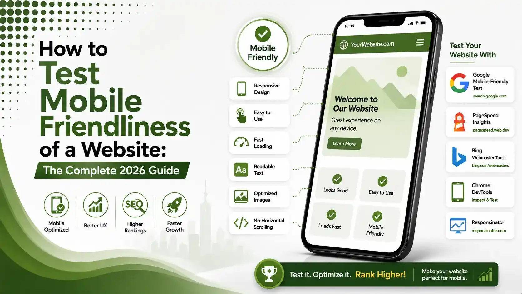
Google's old Mobile-Friendly Test tool is gone. Here's what replaced it, how to read the results, and the fixes that actually move a failing mobile score into passing territory.
Table of Contents
ToggleTesting mobile friendliness of a website used to mean one thing: paste your URL into Google's Mobile-Friendly Test tool and read the verdict. Google retired that tool in December 2023, and the replacement process is more useful but far less obvious if nobody's shown you where to look.
Mobile-first indexing means Google evaluates the mobile version of your site for every search result, not just the ones typed on a phone. If your mobile experience is broken, your entire ranking suffers, desktop included.
Mobile devices now generate roughly 63.8% of global web traffic, and Core Web Vitals research from Thestacc puts the current pass rate at only around 39% to 48% of sites clearing all three thresholds on mobile. That gap between "looks fine" and "actually passes" is exactly what proper testing catches.
This guide walks through the tools that replaced Google's old tester, how to read what they actually tell you, and the fixes that move a failing mobile score into passing territory.
01Why Google's Old Mobile-Friendly Test Tool Is Gone
Plenty of SEO checklists still tell readers to visit Google's Mobile-Friendly Test. That URL is dead. Buzzmatic's 2026 breakdown of mobile testing confirms it plainly: Google shut down both the standalone tester and the Mobile Usability report inside Search Console at the end of 2023.
The binary pass-or-fail answer that tool gave doesn't really match how mobile-friendliness works anymore. MobileViewer.io's 2026 guide to the shutdown puts it well: mobile-friendliness today is a multidimensional question covering performance, layout, and intrusiveness, not a single yes-or-no check.
Update it. Some search results and old blog posts still link to Google's retired tester, and the page either errors out or redirects. The functionality lives on, just split across PageSpeed Insights, Search Console, and Lighthouse.
02Test With Google PageSpeed Insights
PageSpeed Insights is Google's own current answer to mobile-friendliness testing, and it does more than the old tool ever did. Enter a URL, and it runs a full Lighthouse audit covering both a mobile and desktop tab, no installation needed.
SupportHost's 2026 walkthrough of the tool explains why mobile scores usually come in lower than desktop: mobile tests simulate slower networks and weaker processors, which is a fair reflection of what a real phone user actually experiences.
The mobile tab surfaces viewport configuration, font sizing, and tap-target spacing directly in the Diagnostics and Audits sections, the exact checks the old Mobile-Friendly Test used to run, just folded into a broader performance report.
03Test With Chrome DevTools Lighthouse
For a deeper look without leaving your browser, Chrome's built-in DevTools includes the same Lighthouse engine PageSpeed Insights runs on. Open DevTools, switch to the Lighthouse tab, select the mobile device emulation, and run the audit locally.
Buzzmatic's guide, referenced above, recommends this route specifically when testing pages that aren't live yet, staging environments, local builds, or password-protected areas that PageSpeed Insights' live crawler can't reach.
04Check Google Search Console for Ongoing Mobile Issues
PageSpeed Insights and Lighthouse test one page at a time. Search Console's Core Web Vitals report does the opposite, it groups every URL on your site by performance and usability status so problems affecting hundreds of pages don't get missed one URL at a time.
Strataigize's guide to checking mobile friendliness notes this is the tool that tracks issues across your entire site rather than a single snapshot, which makes it the right place to monitor after you've fixed something, not just to diagnose it.
05Test Real-Device Rendering, Not Just Scores
A page can pass every Lighthouse metric and still look broken on an actual phone, overlapping text, buttons that sit behind a sticky header, images that don't crop correctly on a narrower screen. Scores don't catch layout problems that only show up visually.
Tools like MobileViewer.io render your live URL inside real device frames so you can see the layout the way a visitor actually would, across several screen sizes at once, which catches the visual bugs that a numeric score alone tends to miss.
A complete mobile-friendliness test workflow: score a page, monitor the whole site, then verify the visual layout on real devices.
06Mobile Testing Tool Comparison
Digitalapplied's 2026 page speed research and Scalify's mobile traffic data both point to the same conclusion: no single tool covers every angle, so pairing two or three is standard practice now.
| Tool | Best For | Cost |
|---|---|---|
| PageSpeed Insights | Single-page mobile score and Lighthouse audit | Free |
| Chrome DevTools Lighthouse | Staging pages, local builds, offline testing | Free |
| Google Search Console | Site-wide Core Web Vitals monitoring over time | Free |
| MobileViewer.io | Visual layout checks across real device frames | Free tier available |
| SE Ranking / Sitechecker | Full-site mobile usability audits with fix suggestions | Paid, free trial |
07The Viewport Meta Tag Every Mobile-Friendly Page Needs
Most mobile-friendliness failures trace back to one missing line of code. Without a correctly configured viewport meta tag, mobile browsers render your page at desktop width and shrink it down, forcing visitors to pinch and zoom.
<meta name="viewport" content="width=device-width, initial-scale=1">
Pair it with a basic responsive breakpoint structure so content reflows instead of just shrinking:
/* Mobile first: base styles apply to all screens */
.container {
  width: 100%;
  padding: 0 16px;
}

/* Tablet and up */
@media (min-width: 768px) {
  .container {
    max-width: 720px;
    margin: 0 auto;
  }
}

/* Desktop and up */
@media (min-width: 1024px) {
  .container {
    max-width: 960px;
  }
}
08Common Mobile-Friendliness Issues to Fix First
Once a scan flags problems, most fall into a short list of repeat offenders.
Missing or misconfigured viewport tag, the single most common cause of a failed mobile scan.
Text too small to read without zooming; keep body text at 16px or larger on mobile.
Tap targets placed too close together, buttons and links need enough spacing for a finger, not a mouse cursor.
Content wider than the viewport, forcing horizontal scrolling instead of a clean vertical layout.
Unoptimized images that slow mobile load times; compressing them can cut file size by 60% to 80% with no visible quality loss.
Intrusive interstitials like full-screen popups that block content immediately after a mobile visitor arrives.
09Priority Testing Workflow
Five steps cover a complete mobile-friendliness test. Tap each one for the specific action.
Run PageSpeed Insights
Start with the mobile tab in PageSpeed Insights for a single-page score and a full Lighthouse breakdown of what's failing.
10Mobile Friendliness Readiness Score
Score your current mobile setup against the factors that matter most for testing and passing Google's standards.
Mobile Friendliness Readiness Score
Select the option that matches your current setup for each factor
11FAQs on Testing Mobile Friendliness
No. Google retired the standalone tool and the Search Console Mobile Usability report at the end of 2023. Use PageSpeed Insights and the Core Web Vitals report instead.
Run the URL through PageSpeed Insights on the mobile tab. It delivers a score plus a full Lighthouse audit in under a minute.
Mobile tests simulate slower networks and weaker processors on purpose, since that reflects how real phone users actually experience your site.
Yes. Scores don't catch every visual bug. Pair automated testing with a real-device rendering check to confirm the layout actually looks right.
After any major page or template change, and monthly through Search Console to catch drift across your whole site over time.
Related Articles
What We Learn Today
Google's old Mobile-Friendly Test tool was retired in December 2023
PageSpeed Insights now handles single-page mobile scoring
Search Console tracks Core Web Vitals across your whole site
Real-device rendering catches bugs scores alone can miss
A missing viewport tag is the most common mobile failure
Only about 39% of sites currently pass all mobile Core Web Vitals
Build a Complete Local SEO Foundation
Mobile friendliness supports every other ranking factor. Pair this guide with our Google Maps and local citations guides for the complete picture.
Related Posts
Previous Post
Next Post
Previous Post
Next Post



- Artificial Intelligence
- Content
- Core Web Vitals
- Development
- Digital Marketing
- Display Advertising
- Google Ads
- Google Search Console
- GTM
- HTML
- HTML CSS
- JavaScript
- Keyword Research
- Link Building
- LinkedIn Ads
- Local SEO
- Meta Ads
- Mobile SEO
- Off-Page SEO
- On-Page SEO
- Paid Media
- Paid Media Analytics
- PHP
- PPC Strategy
- Python
- SEO
- SEO Basics
- SEO Tools
- Social
- Technical SEO