
- Home
- SEODiscover the latest updates from across the United States, including politics, culture, economy, and trending stories. Stay informed on the key events shaping the nation and the topics everyone’s talking about.
- Technical SEOLearn technical SEO concepts including crawling, indexing, XML sitemaps, robots.txt, canonical tags, site architecture, and website performance.
- Local SEOOptimize your business for local seo with Google Business Profile, local citations, reviews, maps, and location-based SEO.
- Mobile SEOImprove your website’s mobile seo performance with responsive design, mobile-first indexing, usability, and page speed optimization.
- On-Page SEOExplore on-page seo optimization techniques such as title tags, meta descriptions, headings, URLs, internal linking, and content optimization.
- Off-Page SEODiscover off-page SEO strategies such as backlinks, digital PR, brand mentions, outreach, and authority building.
- SEO ToolsExplore the best SEO tools for keyword research, technical audits, backlink analysis, rank tracking, and website optimization.
- Core Web VitalsLearn how to improve Core Web Vitals including LCP, INP, CLS, page speed, and overall user experience for better rankings.
- Keyword ResearchLearn how to find profitable keywords, analyze search intent, evaluate competition, and build effective keyword strategies.
- Link BuildingMaster ethical link building techniques, backlink analysis, outreach methods, guest posting, and authority growth strategies.
- Google Search ConsoleLearn how to use Google Search Console to monitor indexing, fix errors, analyze search performance, and improve SEO.
- SEO BasicsLearn the fundamentals of search engine optimization (SEO Basics), including how search engines work, SEO terminology, and beginner-friendly best practices.
- Paid Media
- Display AdvertisingLearn display advertising strategies, banner ads, audience targeting, remarketing, Google Display campaigns, and optimization techniques.
- Google AdsLearn Google Ads strategies, campaign setup, bidding, keywords, Performance Max, Search Ads, and optimization techniques.
- LinkedIn AdsLearn LinkedIn Ads strategies for B2B marketing, lead generation, audience targeting, campaign optimization, and paid social advertising.
- Meta AdsLearn Meta Ads strategies for Facebook and Instagram, including campaign setup, targeting, retargeting, and performance optimization.
- Paid Media AnalyticsLearn paid media analytics, including CPC, CTR, CPA, ROAS, conversion tracking, attribution, reporting, and campaign performance analysis.
- PPC StrategyLearn effective PPC strategies, campaign planning, bidding, keyword targeting, landing pages, conversion optimization, and more.
- ContentTransform your living spaces with inspiration, tips, and trends in interior design. From minimalist decor to bold statements, find ideas for every style and budget.
- Social
- Digital MarketingExplore stories and advice on living your best life. From personal growth to entertainment, dive into the latest in lifestyle trends and inspiration.
- Artificial IntelligenceStay informed about health and wellness with expert advice, fitness tips, and the latest medical breakthroughs. Your guide to a healthier and happier life.
- DevelopmentYou will find development related educational articles
- GTMLearn Google Tag Manager (GTM) with practical guides for tags, triggers, variables, tracking, conversions, and website analytics implementation.
- HTMLLearn HTML with simple tutorials, examples, tags, elements, attributes, and best practices for building modern web pages.
- HTML CSSLearn HTML CSS together with practical tutorials, examples, layouts, styling techniques, responsive design, and modern web development practices.
- HTML JSLearn HTML JS – JavaScript with practical tutorials and examples for adding interactivity, dynamic content, events, and functionality to web pages.
- JavaScriptExplore JavaScript tutorials, examples, concepts, and practical techniques for creating interactive and dynamic websites and web applications.
- PHPLearn PHP programming with practical tutorials, examples, functions, syntax, and web development techniques for beginners and developers.
- PythonLearn Python programming with practical tutorials, examples, syntax, functions, automation techniques, and useful programming concepts.
- Home
- SEODiscover the latest updates from across the United States, including politics, culture, economy, and trending stories. Stay informed on the key events shaping the nation and the topics everyone’s talking about.
- Technical SEOLearn technical SEO concepts including crawling, indexing, XML sitemaps, robots.txt, canonical tags, site architecture, and website performance.
- Local SEOOptimize your business for local seo with Google Business Profile, local citations, reviews, maps, and location-based SEO.
- Mobile SEOImprove your website’s mobile seo performance with responsive design, mobile-first indexing, usability, and page speed optimization.
- On-Page SEOExplore on-page seo optimization techniques such as title tags, meta descriptions, headings, URLs, internal linking, and content optimization.
- Off-Page SEODiscover off-page SEO strategies such as backlinks, digital PR, brand mentions, outreach, and authority building.
- SEO ToolsExplore the best SEO tools for keyword research, technical audits, backlink analysis, rank tracking, and website optimization.
- Core Web VitalsLearn how to improve Core Web Vitals including LCP, INP, CLS, page speed, and overall user experience for better rankings.
- Keyword ResearchLearn how to find profitable keywords, analyze search intent, evaluate competition, and build effective keyword strategies.
- Link BuildingMaster ethical link building techniques, backlink analysis, outreach methods, guest posting, and authority growth strategies.
- Google Search ConsoleLearn how to use Google Search Console to monitor indexing, fix errors, analyze search performance, and improve SEO.
- SEO BasicsLearn the fundamentals of search engine optimization (SEO Basics), including how search engines work, SEO terminology, and beginner-friendly best practices.
- Paid Media
- Display AdvertisingLearn display advertising strategies, banner ads, audience targeting, remarketing, Google Display campaigns, and optimization techniques.
- Google AdsLearn Google Ads strategies, campaign setup, bidding, keywords, Performance Max, Search Ads, and optimization techniques.
- LinkedIn AdsLearn LinkedIn Ads strategies for B2B marketing, lead generation, audience targeting, campaign optimization, and paid social advertising.
- Meta AdsLearn Meta Ads strategies for Facebook and Instagram, including campaign setup, targeting, retargeting, and performance optimization.
- Paid Media AnalyticsLearn paid media analytics, including CPC, CTR, CPA, ROAS, conversion tracking, attribution, reporting, and campaign performance analysis.
- PPC StrategyLearn effective PPC strategies, campaign planning, bidding, keyword targeting, landing pages, conversion optimization, and more.
- ContentTransform your living spaces with inspiration, tips, and trends in interior design. From minimalist decor to bold statements, find ideas for every style and budget.
- Social
- Digital MarketingExplore stories and advice on living your best life. From personal growth to entertainment, dive into the latest in lifestyle trends and inspiration.
- Artificial IntelligenceStay informed about health and wellness with expert advice, fitness tips, and the latest medical breakthroughs. Your guide to a healthier and happier life.
- DevelopmentYou will find development related educational articles
- GTMLearn Google Tag Manager (GTM) with practical guides for tags, triggers, variables, tracking, conversions, and website analytics implementation.
- HTMLLearn HTML with simple tutorials, examples, tags, elements, attributes, and best practices for building modern web pages.
- HTML CSSLearn HTML CSS together with practical tutorials, examples, layouts, styling techniques, responsive design, and modern web development practices.
- HTML JSLearn HTML JS – JavaScript with practical tutorials and examples for adding interactivity, dynamic content, events, and functionality to web pages.
- JavaScriptExplore JavaScript tutorials, examples, concepts, and practical techniques for creating interactive and dynamic websites and web applications.
- PHPLearn PHP programming with practical tutorials, examples, functions, syntax, and web development techniques for beginners and developers.
- PythonLearn Python programming with practical tutorials, examples, syntax, functions, automation techniques, and useful programming concepts.
Now Reading: Mobile First Indexing Explained
-
01
Mobile First Indexing Explained
- Home//
- SEO//Discover the latest updates from across the United States, including politics, culture, economy, and trending stories. Stay informed on the key events shaping the nation and the topics everyone’s talking about.
- Technical SEO//Learn technical SEO concepts including crawling, indexing, XML sitemaps, robots.txt, canonical tags, site architecture, and website performance.
- Local SEO//Optimize your business for local seo with Google Business Profile, local citations, reviews, maps, and location-based SEO.
- Mobile SEO//Improve your website’s mobile seo performance with responsive design, mobile-first indexing, usability, and page speed optimization.
- On-Page SEO//Explore on-page seo optimization techniques such as title tags, meta descriptions, headings, URLs, internal linking, and content optimization.
- Off-Page SEO//Discover off-page SEO strategies such as backlinks, digital PR, brand mentions, outreach, and authority building.
- SEO Tools//Explore the best SEO tools for keyword research, technical audits, backlink analysis, rank tracking, and website optimization.
- Core Web Vitals//Learn how to improve Core Web Vitals including LCP, INP, CLS, page speed, and overall user experience for better rankings.
- Keyword Research//Learn how to find profitable keywords, analyze search intent, evaluate competition, and build effective keyword strategies.
- Link Building//Master ethical link building techniques, backlink analysis, outreach methods, guest posting, and authority growth strategies.
- Google Search Console//Learn how to use Google Search Console to monitor indexing, fix errors, analyze search performance, and improve SEO.
- SEO Basics//Learn the fundamentals of search engine optimization (SEO Basics), including how search engines work, SEO terminology, and beginner-friendly best practices.
- Paid Media//
- Display Advertising//Learn display advertising strategies, banner ads, audience targeting, remarketing, Google Display campaigns, and optimization techniques.
- Google Ads//Learn Google Ads strategies, campaign setup, bidding, keywords, Performance Max, Search Ads, and optimization techniques.
- LinkedIn Ads//Learn LinkedIn Ads strategies for B2B marketing, lead generation, audience targeting, campaign optimization, and paid social advertising.
- Meta Ads//Learn Meta Ads strategies for Facebook and Instagram, including campaign setup, targeting, retargeting, and performance optimization.
- Paid Media Analytics//Learn paid media analytics, including CPC, CTR, CPA, ROAS, conversion tracking, attribution, reporting, and campaign performance analysis.
- PPC Strategy//Learn effective PPC strategies, campaign planning, bidding, keyword targeting, landing pages, conversion optimization, and more.
- Content//Transform your living spaces with inspiration, tips, and trends in interior design. From minimalist decor to bold statements, find ideas for every style and budget.
- Social//
- Digital Marketing//Explore stories and advice on living your best life. From personal growth to entertainment, dive into the latest in lifestyle trends and inspiration.
- Artificial Intelligence//Stay informed about health and wellness with expert advice, fitness tips, and the latest medical breakthroughs. Your guide to a healthier and happier life.
- Development//You will find development related educational articles
- GTM//Learn Google Tag Manager (GTM) with practical guides for tags, triggers, variables, tracking, conversions, and website analytics implementation.
- HTML//Learn HTML with simple tutorials, examples, tags, elements, attributes, and best practices for building modern web pages.
- HTML CSS//Learn HTML CSS together with practical tutorials, examples, layouts, styling techniques, responsive design, and modern web development practices.
- HTML JS//Learn HTML JS – JavaScript with practical tutorials and examples for adding interactivity, dynamic content, events, and functionality to web pages.
- JavaScript//Explore JavaScript tutorials, examples, concepts, and practical techniques for creating interactive and dynamic websites and web applications.
- PHP//Learn PHP programming with practical tutorials, examples, functions, syntax, and web development techniques for beginners and developers.
- Python//Learn Python programming with practical tutorials, examples, syntax, functions, automation techniques, and useful programming concepts.

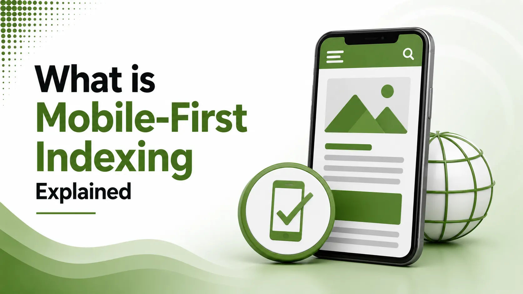
Mobile-first indexing prioritizes the mobile version of a website for Google Search indexing and ranking. Mobile content, usability, structured data, and page performance are important factors.
Table of Contents
ToggleA desktop page can be flawless, fast, keyword-perfect, beautifully structured, and still lose rankings if its mobile version quietly serves less. That single fact confuses more site owners than almost any other change Google has made to how it evaluates the web, and it has been the reality for every site since July 2024.
Mobile first indexing is Google's practice of using the mobile version of a website as the primary basis for crawling, indexing, and ranking, rather than the desktop version.
Whatever Googlebot Smartphone sees on your mobile pages is, for practical purposes, what your entire site is judged on.
This wasn't always how Google worked. For most of search engine history, the desktop version of a page was the reference point, and mobile was treated as a secondary, sometimes stripped-down, experience.
That assumption flipped entirely once mobile traffic overtook desktop traffic worldwide.
Google first announced it was experimenting with this shift back in 2016, then rolled it out gradually, site by site, over the following years.
By July 2024, the transition was officially complete. There is no longer a separate mobile index sitting alongside a desktop one; there is simply one index, built from what the mobile crawler finds.
We covered the broader discovery pipeline this fits into in our crawling and indexing guide. Mobile-first indexing is a specific, permanent rule inside that same pipeline, one that quietly determines what Google actually sees of your content in the first place.
For most modern, responsively designed sites, this change is invisible.
Content, links, and structured data are already identical across devices, so nothing shifts. The real risk sits with older or more complex setups, where the mobile version was built as a lighter, secondary afterthought rather than a genuine equal.
of sites Google crawls and ranks now use mobile-first indexing, as of July 2024
of global web traffic comes from mobile devices, driving this permanent shift
separate mobile index exists; there is only one index, built from the mobile crawl
The Rollout Timeline
Watch: Google's Own Explanation
Video: "Mobile-First Indexing," featuring Martin Splitt, Search Advocate at Google — credit to the original creator, via YouTube
The Content Parity Problem
According to MobileViewer's 2026 guide to mobile-first indexing, any content, link, or schema markup that lives only on the desktop version is effectively invisible to Google. If it's not on mobile, it isn't in the index.
Structured Data Must Match Across Devices
According to Google Search Central's official mobile-first indexing best practices, structured data present on desktop but missing on mobile is treated as if it doesn't exist at all.
<!-- This schema block must appear on BOTH desktop and mobile HTML -->
<script type="application/ld+json">
{
  "@context": "https://schema.org",
  "@type": "Product",
  "name": "Wireless Headphones",
  "review": { "@type": "Review" }
}
</script>
If this block only exists in the desktop template, Google's mobile-first crawl never sees it
Where Content Actually Goes Missing
According to Blue Tangerine's 2026 mobile-first indexing best practices guide, Google recommends moving content into accordions or tabs to save mobile space, rather than removing it outright.
| Common Gap | What to Check |
|---|---|
| Internal links stripped from mobile nav | Confirm mobile menu links to the same pages as desktop |
| Images/videos missing alt text on mobile | Same alt text, filenames, and captions on both versions |
| Structured data desktop-only | Verify with URL Inspection which version Google actually sees |
| CSS/JS blocked from mobile crawler | Confirm robots.txt doesn't block rendering-critical files |
Why This Change Happened in the First Place
According to DigitalApplied's 2026 mobile SEO guide, mobile traffic now exceeds 60% of total global web traffic, and for local, retail, and consumer-facing categories, that figure climbs above 75%.
Continuing to evaluate the web primarily through a desktop lens made less and less sense as that gap widened. Mobile-first indexing simply aligned Google's evaluation method with how people were actually browsing.
Three Site Configurations, Three Different Risk Levels
According to Nostra's complete guide to mobile-first indexing, responsive design, dynamic serving, and separate mobile URLs each carry a different level of parity risk, with responsive design generally the safest by default.
Dynamic serving and separate URL setups require considerably more technical diligence to keep content, metadata, and structured data genuinely synchronized between versions, since they are technically two different sets of files rather than one shared template.
What Happens When Errors Differ Between Versions
According to Google Search Central's official documentation referenced above, if a desktop page serves normal content but its mobile counterpart returns an error page, that page becomes entirely missing from the index once mobile-first indexing applies.
URL fragments, the part of a URL starting with #, present another quiet risk. Google has stated that most fragment URLs are not indexable, meaning any content relying on that pattern for mobile navigation may never make it into the index at all.
Mobile Parity Risk Checker
Score your site against the most common mobile-first indexing gaps.
Mobile Parity Risk Checker
Select the option that best matches your site for each factor
How to Check Which Version Google Actually Uses
According to Eminence's guide to Google mobile-first indexing, Search Console's URL Inspection tool shows exactly which version, desktop or mobile, Google used to index a specific page.
According to WebFX's guide to optimizing for mobile-first indexing, Google's free Mobile-Friendly Test tool offers a fast secondary check, confirming whether a page meets baseline mobile usability standards before diving into a full parity audit.
According to WiseRank's guide to Google's mobile-first indexing rollout, reviewing crawl stats and user agent reports inside Search Console confirms how frequently Googlebot Smartphone actually visits a site, offering a useful secondary signal alongside URL Inspection.
FAQs on Mobile-First Indexing
Related Articles
> what_we_learn_today.log
Mobile-first indexing has been fully complete since July 2024
Googlebot Smartphone is the primary crawler for effectively every site
Content missing from mobile is invisible to Google, regardless of desktop quality
Structured data must appear identically on both mobile and desktop
URL Inspection in Search Console shows which version Google actually used
Responsive design avoids most parity risk by design
Related Posts
Previous Post
Next Post
Previous Post
Next Post


- Artificial Intelligence
- Content
- Core Web Vitals
- Development
- Digital Marketing
- Display Advertising
- Google Ads
- Google Search Console
- GTM
- HTML
- HTML CSS
- JavaScript
- Keyword Research
- Link Building
- LinkedIn Ads
- Local SEO
- Meta Ads
- Mobile SEO
- Off-Page SEO
- On-Page SEO
- Paid Media
- Paid Media Analytics
- PHP
- PPC Strategy
- Python
- SEO
- SEO Basics
- SEO Tools
- Social
- Technical SEO