
Now Reading: Dark Mode CSS Architecture: 7 Steps Beyond the Prefers Color Scheme Media Query
-
01
Dark Mode CSS Architecture: 7 Steps Beyond the Prefers Color Scheme Media Query
Dark Mode CSS Architecture: 7 Steps Beyond the Prefers Color Scheme Media Query

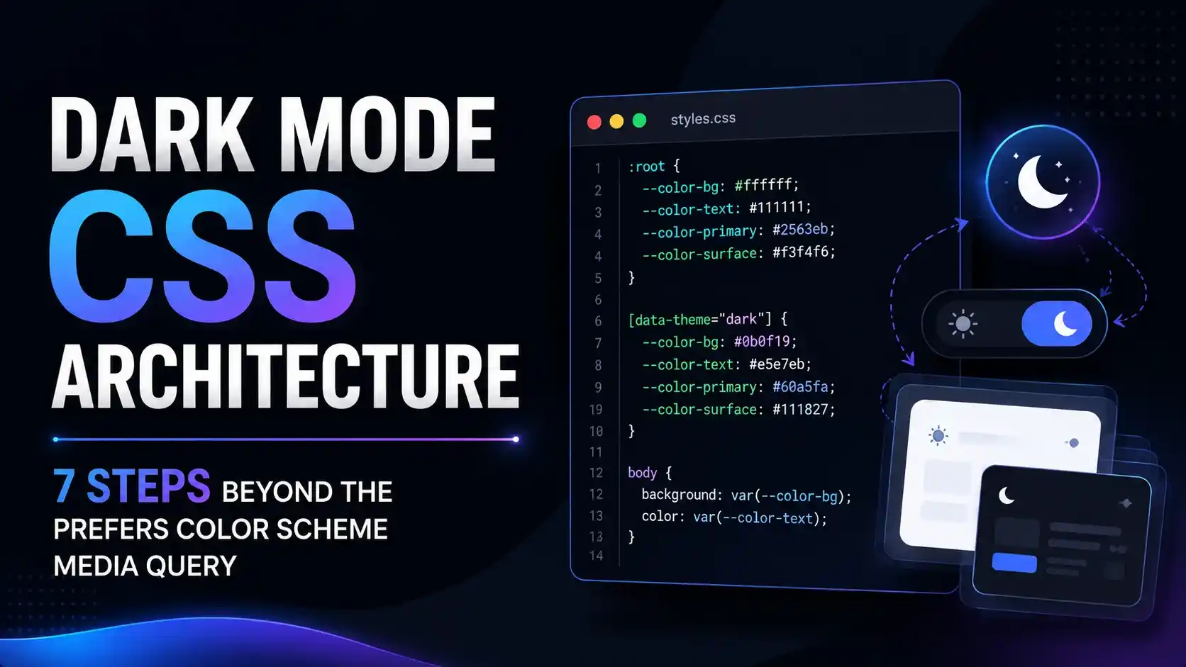
A layered approach to dark mode CSS architecture built on semantic tokens and a data-theme override, with a real getComputedStyle() proof that the override survives repeated emulated OS preference flips in Chromium.
Alright, let's talk about the dark mode setup that looks great in a blog post demo and then falls apart the moment a real user asks for a manual light or dark toggle on top of it.
You already have a media query that flips your colors when the operating system says so. That part is the easy ten percent. The hard ninety percent is everything a single media query can never do on its own: a manual toggle, a per page override, a flash free page load, and native form controls that actually match. That full system is what a real dark mode css architecture looks like.
What Is Dark Mode CSS Architecture?
Dark mode css architecture is the layered system of design tokens, semantic custom properties, and an explicit theme attribute that decides how a page looks, with the operating system's preference as just one input among several, not the only one.
A single media query can only ever answer one question: what does the operating system currently prefer. It cannot remember that a visitor manually chose light mode five minutes ago. It cannot let a marketing page force dark mode regardless of the system setting. A proper architecture separates "what color is this" from "who gets to decide the color."
:root {
  --bg: #ffffff;
  --fg: #1a1a1a;
}

:root[data-theme="dark"] {
  --bg: #121212;
  --fg: #f0f0f0;
}
Every component then reads var(--bg) and var(--fg) instead of a literal color value. The theme itself lives in one place, an attribute on the root element, and every component simply inherits whatever that attribute currently resolves to.
Name your tokens by role, not by appearance. --bg and --fg survive a theme change. A token literally named --white does not, since it stops being white the moment dark mode turns it into something else.
Why the Prefers Color Scheme Media Query Isn't Enough Alone
The prefers-color-scheme media query is genuinely useful. It is also, by itself, a read only signal. A media query cannot be overridden by a click, cannot be forced by a page, and cannot be tested independently of your actual operating system settings without extra tooling.
@media (prefers-color-scheme: dark) {
  body {
    background: #121212;
  }
}
/* there is no CSS way to override this from a button click */
That last line is the whole problem in one comment. Once a user clicks a toggle expecting the page to switch, or expecting their choice to stick while they browse, the media query alone has nothing left to offer. A real dark mode css architecture needs a second, higher priority signal sitting above it.
Caniuse's own tracking data shows the media query itself has been safe to rely on for years now, which is exactly why the gap worth closing today is the override layer on top of it, not the media query's browser support.
According to WebKit's own 2019 announcement, dark mode support in Safari was introduced specifically as a media feature developers could read, never one a page could set on behalf of the operating system, by design.
The Three Layer Token Architecture
A resilient dark mode css architecture separates concerns into three layers. Raw palette tokens hold literal color values and are never referenced directly by components. Semantic tokens like --bg and --fg map to a raw token per theme. Components only ever reference the semantic layer.
/* layer 1: raw palette, theme agnostic */
:root {
  --palette-ink-900: #121212;
  --palette-paper-50: #ffffff;
}

/* layer 2: semantic mapping, theme aware */
:root[data-theme="light"] {
  --bg: var(--palette-paper-50);
}
:root[data-theme="dark"] {
  --bg: var(--palette-ink-900);
}

/* layer 3: components, theme blind */
.card { background: var(--bg); }
This layering borrows directly from established CSS organization principles rather than anything specific to theming. Harry Roberts' writing on layered CSS architecture makes the same case for a completely different reason: specificity and maintainability, which happen to be exactly what a dark mode system also needs to stay sane past ten components.
Once a component only ever touches the semantic layer, adding a third theme, a high contrast mode, or a seasonal brand palette becomes a matter of adding one more block at layer two. Nothing in layer three has to change at all.
Building an Override That Beats the System, Verified in a Real Browser
Here is the architecture actually working, tested in real Chromium with a genuinely emulated operating system preference, not a screenshot of a toggle that may or may not do anything underneath.
The setup: a data-theme attribute on the root element takes priority over the prefers-color-scheme media query in the cascade, purely because an attribute selector beats a media query once both are present. We emulated the OS reporting dark, then set an explicit light override, then flipped the emulated OS preference twice more to prove the override survives both flips.

The override beats system priority rule, checked in plain JavaScript against five real system and override combinations before touching a real browser at all.

Real Chromium, real page.emulateMedia() calls. The explicit light override set --bg to #ffffff and it stayed #ffffff through two more simulated flips of the operating system's own reported preference.
Nothing about that result is a coincidence of CSS specificity. It works because :root[data-theme="light"] is an attribute selector, and an attribute selector on the same element always outranks a media query wrapped around a lower specificity selector once both are trying to set the same property.
await page.emulateMedia({ colorScheme: 'dark' });
document.documentElement.setAttribute('data-theme', 'light');
// --bg still resolves to #ffffff even after the OS is emulated dark againThe Color Scheme Property and Native Form Controls
Your own CSS only paints the elements you style. It has no say over a browser's native scrollbar, a checkbox, a date picker, or spellcheck squiggles, all of which stay stuck in light mode unless you tell the browser otherwise.
:root[data-theme="dark"] {
  color-scheme: dark;
}
:root[data-theme="light"] {
  color-scheme: light;
}
MDN confirms the color-scheme property has been baseline widely available since January 2022, and it is exactly what tells the browser to restyle its own native UI to match your theme rather than leaving it light by default.
A matching meta name="color-scheme" tag, placed in the head before any stylesheet, prevents a brief flash of the wrong native UI color while your own CSS is still loading. web.dev's own guidance recommends shipping both the meta tag and the CSS property together rather than relying on either alone.
Set color-scheme: light dark on an element that should always follow the system, and set an explicit single value only on the branch of the tree where your override is actively forcing a theme.
Preventing a Flash of the Wrong Theme
If your theme decision runs inside a deferred script tag, the browser paints the default theme first, then repaints once your script finally runs. On a slow connection that flash is genuinely visible, and it undermines the whole point of a careful dark mode css architecture.
<head>
  <script>
    // runs synchronously, before first paint, before any stylesheet
    const saved = getSavedOverride();
    if (saved) document.documentElement.setAttribute('data-theme', saved);
  </script>
</head>
The fix is a tiny, render blocking, inline script placed as early as possible in the head, before your main stylesheet. It reads the saved override and sets the attribute synchronously, so the very first paint already reflects the correct theme instead of correcting itself a moment later.
The W3C's Media Queries Level 5 specification defines prefers-color-scheme purely as a user preference signal, with no mechanism in the spec itself for a page to write back to it, which is exactly why the override has to live in your own markup instead.
Common Pitfalls in a Dark Mode CSS Architecture
The most common failure is a hardcoded color slipping past the token layer. One inline style="background: white" or one component still written against #fff directly breaks the whole system in exactly the place a code review is least likely to catch it.
The second is forgetting that images, icons, and embedded charts need their own dark variant or a filter based adjustment. A token swap changes backgrounds and text instantly. It does nothing at all for a PNG logo with a transparent background designed against a white page.
The third is skipping a contrast check after the swap. A palette that passes accessibility contrast ratios in light mode is not guaranteed to pass in dark mode, since darker backgrounds change every ratio in the pair, sometimes for the worse.
- Route every color in your dark mode css architecture through a semantic token. No component should reference a raw hex value directly.
- Ship the
color-schemeproperty alongside your own tokens. Native form controls and scrollbars need it separately. - Block first paint with a tiny inline script. That is the only reliable fix for a flash of the wrong theme.
- Recheck contrast ratios in both themes. A pairing that passes in light mode can fail in dark mode.
If your components already sit inside a layout built with CSS container queries, the same semantic token approach slots in cleanly, since a themed card and a container aware card are solving two completely independent problems with the same custom property mechanism.
Teams already tracking Core Web Vitals should treat a theme flash as seriously as any other unexpected repaint, since layout shift tooling can flag the visual jump even when no element actually moved position.
CSS-Tricks' complete guide to dark mode and Chrome's own developer blog are both worth bookmarking alongside this one, since browser level automatic dark theming continues to evolve independently of anything a page author controls directly.
Frequently Asked Questions About Dark Mode CSS Architecture
Yes. It remains the correct default for any visitor who has never expressed an explicit preference on your site. A full dark mode css architecture uses it as the starting point, then layers an optional override on top.
Either works technically. An attribute reads slightly cleaner in markup and pairs naturally with attribute selectors, but the underlying architecture, an explicit selector overriding a media query, is identical either way.
A theme decision that runs after the browser has already painted a default. The fix is a small synchronous script placed before any stylesheet in the head, so the first paint is already correct.
Yes, and independently of your light mode results. Every color pairing needs its own contrast check once it exists in a dark palette, since the ratio math changes even when the visual intent stays the same.
Yes. The color-scheme CSS property, paired with a matching meta tag, is what tells the browser to restyle scrollbars, checkboxes, and other native UI to match your theme rather than staying light by default.
Learn Today
Semantic Token
A named custom property like --bg that maps to a different raw value per theme, referenced by components instead of a literal color.
Data Theme Attribute
An explicit attribute on the root element that overrides the system preference wherever it is present.
Color Scheme Property
A CSS property that tells the browser to restyle its own native UI, like scrollbars and form controls, to match your theme.
Theme Flash
A visible flip from the wrong default theme to the correct one, caused by a theme decision running after first paint.
Render Blocking Script
A small synchronous script placed before any stylesheet, used here to set the theme attribute before the first paint happens.
Raw Palette Token
A theme agnostic color value that a semantic token points to, never referenced directly by a component.
Ready to Architect Your Own Theme System?
Start with three semantic tokens, one data-theme attribute, and let everything else read from them.