
Now Reading: CSS Container Queries Explained: 2026 Browser Support and Real Layout Proof
-
01
CSS Container Queries Explained: 2026 Browser Support and Real Layout Proof
CSS Container Queries Explained: 2026 Browser Support and Real Layout Proof

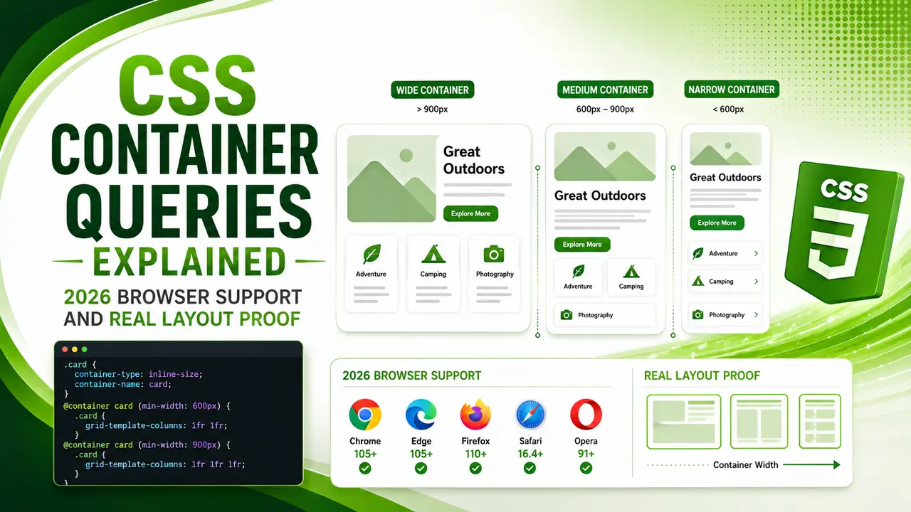
Learn how CSS container queries let components respond to their own container's size instead of the viewport, with 2026 browser support data and a real getComputedStyle() proof across two containers in one shared viewport.
Quick one before we start. If you have ever shrunk a browser window and watched a card component look perfect at every width, then dropped that same card into a narrow sidebar and watched it fall apart, this article explains exactly why that happens and how to fix it for good.
You already reach for a media query without thinking twice. But a media query only ever asks one question: how wide is the browser window? It has no idea whether your component is sitting in a full width hero or squeezed into a 320px sidebar widget. CSS container queries answer a completely different question, and once you see it, you cannot unsee it.
What Are CSS Container Queries?
CSS container queries let an element style itself based on the size of its own containing box, not the size of the browser viewport. You mark an ancestor as a query container, and every descendant inside it can react to that container's width instead of the window's width.
That single shift is why the feature exists at all. A product card, a pricing plan, a navigation item, or a sidebar widget rarely cares how wide the whole page is. It cares how much room it personally has to work with.
The syntax has two moving parts. First you opt an element into containment with the container-type property, then you write conditions inside an @container rule the same way you would write a normal media query.
.card-shell {
  container-type: inline-size;
  container-name: card;
}

/* runs only when .card-shell is 500px or wider */
@container card (min-width: 500px) {
  .card {
    flex-direction: row;
  }
}
Notice the card itself does not carry container-type. That belongs on the wrapper. A container query always looks upward at an ancestor that has opted in, never at itself, since an element cannot query its own size while that size is still being decided.
The W3C's own specification defines exactly how a css container query resolves against its nearest containing block, right down to what happens when no container is found at all.
Give every container a name with container-name once you have more than one nested container on the page. Without a name, an unnamed @container rule matches the nearest ancestor container, which gets confusing fast in a deeply nested layout.
Container Queries vs Media Queries
A media query is a page level decision. It asks the browser one question, how wide is the viewport right now, and every element on the page gets the same answer whether it is relevant to that element or not.
That works fine when a layout only ever appears in one place. It breaks down the moment you build reusable components, which is most of modern front end work. A card in a three column grid and the same card in a one column footer need opposite layouts at the exact same viewport width.
Before container queries, developers solved this with JavaScript, watching an element's size via ResizeObserver and toggling classes by hand. It worked, but it added a runtime dependency to something that is fundamentally a styling decision.
According to web.dev's guidance on responsive design, the healthiest components are the ones that describe their own rules rather than depending on global page state. That is precisely the gap css container queries close, no observer required, no extra script, no layout recalculation loop.
Size based container queries now reach roughly 94% of global browser traffic, according to caniuse.com's tracking data, putting the feature well past the point most teams consider safe for production without a fallback.
CSS Container Queries Browser Support in 2026
This is the part most teams want answered before committing to the feature. Size based css container queries, the kind covered in section one, shipped in Chrome and Edge starting with version 105, Safari 16.0, and Firefox 110.
| Browser | Size Queries | Container Query Units | Style Queries |
|---|---|---|---|
| Chrome / Edge | Version 105+ | Version 105+ | Version 111+, partial |
| Safari | Version 16.0+ | Version 16.0+ | Version 18.0+, partial |
| Firefox | Version 110+ | Version 110+ | Version 151+, full |
Every current major desktop and mobile browser can run the size query pattern from section one today with no fallback needed for a typical audience. Safari's own engine notes confirm exactly when that support landed, which is worth checking directly whenever you need to defend the decision to a stakeholder.
Style queries, covered fully in section six, are the newer and less settled part of the spec. Firefox has full support as of version 151, while Chrome, Edge, and Safari still ship partial implementations, so treat that piece as progressive enhancement rather than a load bearing feature for now.
You do not have to trust a table alone. CSS.supports() lets you check container query support at runtime, directly in the browser doing the rendering, which is exactly what we did for the real proof coming up next.
Building Your First Container Query, Verified in a Real Browser
Reading the syntax is one thing. Watching it happen in real Chromium, with two containers of different widths in the same viewport, makes the idea click.
The rule under test is simple. A card sits inside a container. Once that container reaches 500px wide, the card switches from a stacked column to a horizontal row, purely through CSS, no JavaScript reading any width at all.

A plain JavaScript function mirroring the same 500px breakpoint used by the real @container rule, checked against five container widths.
That first check is just logic, proving the breakpoint math is sound. The real test has to happen where CSS container queries actually run, inside an engine that resolves layout, so we launched real Chromium, built two containers at fixed widths in the same viewport, and read the computed flex-direction straight out of the live DOM.

Same 1280px viewport, two real containers. The 700px container renders row, the 320px container renders column, and shrinking the wide container live flips it back to column with zero JavaScript involved.
That last line is the entire point of css container queries in one screenshot. Nothing about the browser window changed between those three readings. Only the container's own width changed, and the layout followed it every time, exactly the behavior a media query can never produce on its own.
const wideDir = await page.evaluate(() =>
  getComputedStyle(document.querySelector('#wideShell .card')).flexDirection
);
// wideDir === "row", narrowDir === "column", same viewportContainer Query Units for Fluid Sizing
CSS container queries also introduced a matching set of length units, so you can size things relative to the container without writing a single condition at all. The main ones you will use are cqw, cqh, cqi, and cqb, standing for container query width, height, inline size, and block size.
A heading sized in cqi grows and shrinks smoothly as its container resizes, without the stepped, jumpy feeling of a value that only changes at fixed breakpoints.
.card-title {
  font-size: clamp(1rem, 4cqi, 1.5rem);
}
Wrapping the unit inside clamp() keeps it from ever shrinking below a readable size or growing past a sensible cap, which is the same pattern most teams already use for fluid type sizing with viewport units, just aimed at the container instead of the window.
Container query units need container-type set on an ancestor the same as size queries do. Without an active query container above it, an element using cqi or cqw falls back to treating the initial containing block as its reference, which is rarely what you intended.
Style Queries: The Newer, Less Settled Half of the Spec
Size queries answer "how wide is my container." Style queries answer a completely different question: "what custom property value is currently set on my container." That lets a component react to a design token, like a dark theme flag, rather than a pixel measurement.
.card-shell { --theme: dark; }

@container style(--theme: dark) {
  .card {
    background: #111;
    color: #fff;
  }
}According to caniuse.com, Firefox is currently the only major engine with full style query support, while Chrome, Edge, and Safari still ship it as a partial implementation, which is exactly why section three of this guide keeps size queries and style queries in separate rows.
Because support is uneven, treat a style query as an enhancement layer today. Ship the default appearance first, then let the style query adjust it for browsers that understand it, rather than depending on it for anything structural.
Chrome's own developer blog has published several real production case studies of css container queries solving exactly this kind of component layout problem, well worth a read once your first component ships.
Common Pitfalls When Adopting CSS Container Queries
The single most common mistake is querying an element's own container from itself. Set container-type on the wrapper, never on the element carrying the @container rule, or the browser has no stable size to measure against.
The second mistake is forgetting that container-type: inline-size establishes a new containment context, changing how percentage heights and some positioning behave inside it. Test the wrapper in isolation first.
The third is skipping names entirely. On a small page one unnamed container is fine, but on a real site with nested cards inside grids inside sections, an unnamed @container rule can match the wrong ancestor, and the bug is hard to spot without DevTools.
- Put
container-typeon the wrapper, not the styled element. A container cannot query its own size while resolving it. - Name every container once you have more than one. An unnamed query matches the nearest container, which is not always the one you meant.
- Check CSS.supports() before relying on style queries. Size queries are safe everywhere in 2026, style queries are not yet.
- Watch percentage heights inside a contained wrapper. Containment changes how some inherited sizing resolves.
Once you have those four checked, MDN's container query guide is the reference worth bookmarking for every property and unit this feature exposes, since the syntax surface is larger than most teams expect at first glance. OddBird's syntax guide, written by engineers who helped shape the original css container queries proposal, is worth bookmarking alongside it.
If your components already live inside a grid built with CSS Grid's auto fit pattern, container queries are the natural next layer on top of it, letting the card react to the column it lands in rather than only the number of columns the grid renders.
CSS-Tricks documented the earliest working implementations of container queries years before they shipped anywhere, built entirely on JavaScript backed ResizeObserver polyfills, which is exactly the runtime cost native container queries were designed to remove.
There is a performance angle too. A JavaScript resize polyfill competes for main thread time that could otherwise go toward Interaction to Next Paint. Moving that logic into native CSS removes a class of thrashing that used to show up in layout shift audits.
If you still need to support an older browser without container query support, a JavaScript ResizeObserver fallback behind a CSS.supports('container-type: inline-size') check keeps the enhancement optional rather than load bearing.
Teams tracking Core Web Vitals in 2026 increasingly reach for container queries specifically because they replace runtime layout logic with something the rendering engine already has to compute anyway, which is a genuinely free performance win rather than a tradeoff.
Frequently Asked Questions About Container Queries
Yes, for size based container queries. Global support sits at roughly 94% according to caniuse.com, covering every current version of Chrome, Edge, Safari, and Firefox, which is enough for most production audiences without a fallback.
No. Media queries still handle page level decisions like overall layout direction or print styling. CSS container queries handle component level decisions. Most real projects use both together.
The @container rule is simply ignored, and the element keeps whatever base styles you defined outside it. Design the default state to look acceptable on its own, then layer the container query on top as an enhancement.
They work the same way mathematically, but measure a different reference box. A viewport unit like vw measures the browser window. A container query unit like cqw measures the nearest query container instead.
Yes, and this is exactly why naming containers matters. A named @container rule targets a specific ancestor container by name, so a deeply nested layout with several containers stays predictable instead of matching whichever one is closest.
Learn Today
Container Type
The property that opts an element into being a query container, most commonly set to inline-size.
Container Name
An optional label so an @container rule can target a specific ancestor in a nested layout.
Container Query Units
Length units like cqw and cqi that scale relative to the container instead of the viewport.
Style Query
A newer @container condition that checks a custom property value instead of a size.
Containment Context
The layout boundary a contained element creates, which can change how percentage sizing resolves inside it.
Progressive Enhancement
Shipping a working default first, then layering a newer feature like a style query on top for browsers that support it.
Ready to Ship Container Aware Components?
Start with one card component, add container-type to its wrapper, and let the rest of your design system follow.