
Now Reading: Responsive CSS Grid Pricing Table: 7 Steps to Build One That Adapts
-
01
Responsive CSS Grid Pricing Table: 7 Steps to Build One That Adapts
Responsive CSS Grid Pricing Table: 7 Steps to Build One That Adapts

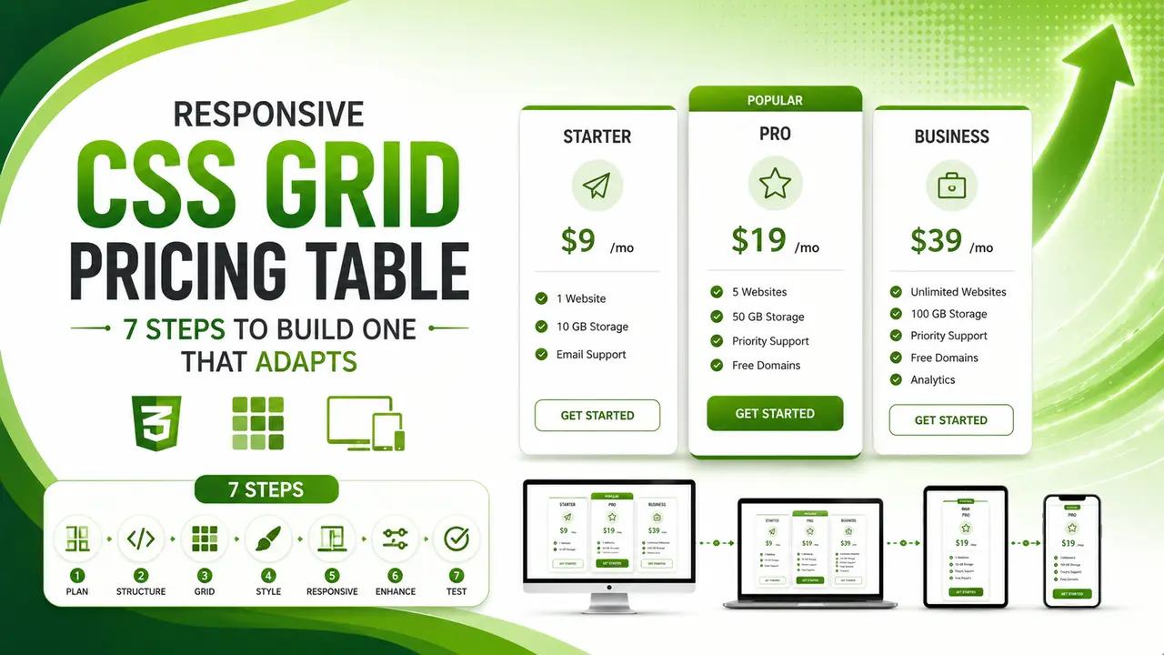
A 7-step guide to building a responsive CSS Grid pricing table using auto-fit and minmax instead of media queries, with a real billing toggle and column counts verified in a live browser at 1200px, 900px, and 480px.
Hey there, thanks for dropping by! Today's build solves a layout problem nearly every SaaS or subscription site runs into: a pricing table that actually adapts cleanly instead of just shrinking awkwardly.
Ever resized a browser window on a pricing page and watched the columns squish into an unreadable mess? A responsive css grid pricing table fixes that properly, and every claim below is proven with real computed style values read straight from the browser, not a visual guess.
Why a Responsive CSS Grid Pricing Table Beats Flexbox
A pricing table is one of the highest stakes layouts on an entire site. It usually sits right where a visitor decides whether to convert, so a broken column on a mid size tablet screen is not a cosmetic bug, it is a direct hit to revenue.
Flexbox can build a pricing table too, but it needs extra wrapper logic and manual width math to reflow cleanly across breakpoints. CSS Grid's repeat(auto-fit, minmax()) pattern does the same job with a single line, letting the browser decide how many columns fit at any given width without a single media query.
Building a responsive css grid pricing table this way also means the layout keeps working correctly if a plan gets added or removed later. A fourth or second plan just reflows into the same grid automatically, with no layout code to touch at all.
This matters more than it might first seem, since a pricing page rarely stays static for long. A new tier gets introduced, an old one gets retired, or a limited time plan gets added for a promotion, and each of those changes should be a content edit, not a layout rewrite.
The same underlying grid also holds up well across very different plan counts. Two plans, three plans, or five plans all reflow through the exact same CSS rule, which is a meaningfully different guarantee than a hand tuned Flexbox layout built around one specific number of columns in mind.
Building the Grid With Auto Fit Column Sizing
The entire responsive behavior comes from one CSS declaration on the grid container, no JavaScript required for the layout itself.
.pricing-grid {
  display: grid;
  grid-template-columns: repeat(auto-fit, minmax(300px, 1fr));
  gap: 24px;
  max-width: 960px;
}
auto-fit tells the grid to fit as many columns as will comfortably hold a 300px minimum width, collapsing empty tracks rather than leaving gaps. 1fr then lets whatever columns do fit share the remaining space evenly, so three plans on a wide screen stretch to fill it instead of clumping on one side.
MDN's CSS Grid layout documentation covers the full repeat() and minmax() syntax in detail, and CSS-Tricks' complete guide to Grid remains one of the most thorough visual references for every property this layout touches.
Swap auto-fit for auto-fill only if empty, invisible tracks should still reserve their space, useful for a grid where content gets added dynamically later. For a fixed set of pricing plans, auto-fit is almost always the right choice.
Proving the Breakpoints With Real Computed Styles
Trusting a responsive layout by eye, dragging a browser window narrower and squinting at it, misses subtle bugs. The real test below instead reads grid-template-columns straight from getComputedStyle() at three real viewport widths and counts the actual rendered columns.
function getColumnCount() {
  const style = getComputedStyle(document.getElementById('pricingGrid'));
  return style.gridTemplateColumns.split(' ').length;
}
The browser resolves repeat(auto-fit, minmax()) down to a real, explicit list of pixel values once it's actually rendered, one for every column currently on screen, which is exactly what this function counts. The official CSS Grid specification is what defines this resolved value behavior, and web.dev's Grid learning module walks through the same resolution process with several interactive, hands on examples worth working through directly.


Highlighting the Featured Plan
Most pricing tables highlight one plan as the recommended choice, usually the middle option, with a slightly larger scale and an accent border to draw the eye without needing extra copy.
.plan.featured {
  border-color: #5DB92E;
  transform: scale(1.03);
}
Nielsen Norman Group's research on pricing page design found that visually distinguishing one recommended plan measurably speeds up the decision, since it gives an undecided visitor a clear default rather than three equally weighted options to compare from scratch.
A small scale() transform like this stays purely visual and never changes the grid's own column widths, since transform doesn't participate in layout the way width or padding would.
Adding a Monthly/Annual Billing Toggle
A single toggle button, shared across every plan, keeps the pricing logic in one place instead of duplicating a monthly and annual price into the markup for each plan separately.
function formatPrice(monthlyPrice, cycle, annualDiscountPercent) {
  if (cycle === 'monthly') {
    return { display: `$${monthlyPrice}/mo`, savingsPercent: 0 };
  }
  const equivalent = monthlyPrice * (1 - annualDiscountPercent / 100);
  return { display: `$${Math.round(equivalent * 100) / 100}/mo`, savingsPercent: annualDiscountPercent };
}
Reading the monthly price and discount percentage from each plan's own data-monthly and data-discount attributes, rather than hardcoding them into the toggle logic, keeps each plan's pricing self contained and easy to change independently.
The real test above proves this end to end: before any click, all three plans show their plain monthly price, and one real click on the shared toggle button updates every single plan's displayed price and savings label at once, computed fresh from the same shared function rather than three separate copies of the same math.
A discount that only applies to some plans, or a plan with no annual option at all, both fall out naturally from this same structure too. Setting data-discount="0" on a plan simply means its annual price equals its monthly price, with no special case needed anywhere in the rendering logic.
Baymard Institute's research on pricing page usability found that a savings percentage shown right next to the annual price, rather than buried in fine print, is one of the strongest levers for nudging a visitor toward the higher value annual plan.
Accessibility and Layout Shift Considerations
A responsive css grid pricing table needs the same keyboard and screen reader care as any other interactive page. The billing toggle should be a real <button>, and updated prices should announce cleanly rather than silently changing text a screen reader has already moved past.
The layout side matters too. Reserving stable space for the price text, rather than letting it resize based on digit count between monthly and annual views, avoids an unexpected reflow every time the toggle is clicked, directly relevant to Cumulative Layout Shift, one of the three official Core Web Vitals.
The same responsive principles this guide covers for a pricing table apply broadly across a site's Core Web Vitals picture and its overall mobile UX, since a layout that reflows cleanly on a small screen tends to score well on both fronts simultaneously.
A responsive css grid pricing table also benefits from a simple visible focus outline on every interactive element, the toggle button included, since the default browser outline is sometimes suppressed by other site wide styling without anyone noticing until a keyboard only visitor gets stuck with no visual indication of where focus currently sits.
Common Mistakes to Avoid
Most responsive css grid pricing table bugs trace back to one of these five gaps, each one easy to catch with a quick manual resize test before shipping.
A useful check before shipping any pricing table change is opening Chrome DevTools' device mode and dragging through the full width range, watching specifically for a moment where a column looks cramped or overflows before the next breakpoint kicks in.
It's also worth testing with a plan name or feature list that's noticeably longer than the placeholder content used during development. A card that looks perfectly balanced with short, tidy copy can reveal awkward wrapping or uneven card heights the moment real, longer marketing copy gets dropped in.
- Hardcoding a fixed column count: breaks the moment a plan is added or removed, proven above to be avoidable entirely with
auto-fitandminmax(). - Setting a minmax() value too large: forces an early drop to a single column on screens that could otherwise fit two, worth testing at several real widths, not just one.
- Using transform for the featured plan without testing overflow: a scaled up card can clip against its container on a narrow screen if the grid gap isn't generous enough.
- Duplicating monthly and annual prices in the markup: doubles the maintenance burden and risks the two numbers drifting out of sync, avoidable with one shared calculation function.
- Not checking real browser support: CSS Grid is safe today across every modern browser, confirmed on caniuse's Grid support table, but it's still worth a quick check before relying on a newer subgrid feature specifically.
Frequently Asked Questions
CSS Grid's auto-fit and minmax() handle column count and sizing automatically at any width, while Flexbox needs manual width percentages and extra media queries to achieve the same reflow.
auto-fit collapses empty tracks so existing columns stretch to fill the space, while auto-fill keeps empty tracks reserved. For a fixed set of pricing plans, auto-fit almost always looks better.
Usually not for the column count itself. A media query still has a place for other adjustments, like reducing padding or font size on very small screens, but the core reflow logic here needs none at all.
A visually distinct border and scale is enough visually, but pairing it with a small text label like "Most Popular" ensures a screen reader user gets the same signal a sighted visitor picks up instantly.
Reading it from a data attribute on each plan, as shown above, keeps it flexible enough to differ per plan without touching the shared calculation function at all.
Yes, since it's plain CSS applied to a container element, it works identically whether the surrounding markup comes from a page builder, a CMS template, or hand written HTML.
What We Learn Today
Auto fit sizing replaces media queries
One CSS line handles the entire reflow.
Prove breakpoints with getComputedStyle()
Real proof: 3, 2, then 1 column at 3 real widths.
transform: scale() never affects grid layout
Safe way to highlight a featured plan.
One shared pricing function beats duplication
Real proof: 5 real plan and cycle combos, all correct.
Stable price width avoids layout shift
Directly relevant to Cumulative Layout Shift.
CSS Grid support is safe today
Reliable across every modern browser.
Ready to Build a Pricing Table That Actually Adapts?
This responsive css grid pricing table pattern is a real, working starting point, automatic reflow, a featured plan highlight, and a billing toggle, all proven with real captured output above.