
Now Reading: HTML picture Element for Responsive Images
-
01
HTML picture Element for Responsive Images

A practical guide to the HTML picture element, with real currentSrc proof of art directed breakpoints, AVIF/WebP format fallback, and srcset resolution switching in action. Category: Development / HTML
Good morning! If your site has ever shipped one giant hero photo to every visitor, phone and desktop alike, and watched mobile load times pay the price, today's topic fixes exactly that.
Picture someone browsing your site on a train, on a patchy connection, on a screen a third the width of a laptop. They don't need your full resolution banner shrunk down by CSS. They need a smaller file that was made for their screen in the first place, and that's the job the HTML picture element was built for.
What Is the HTML Picture Element?
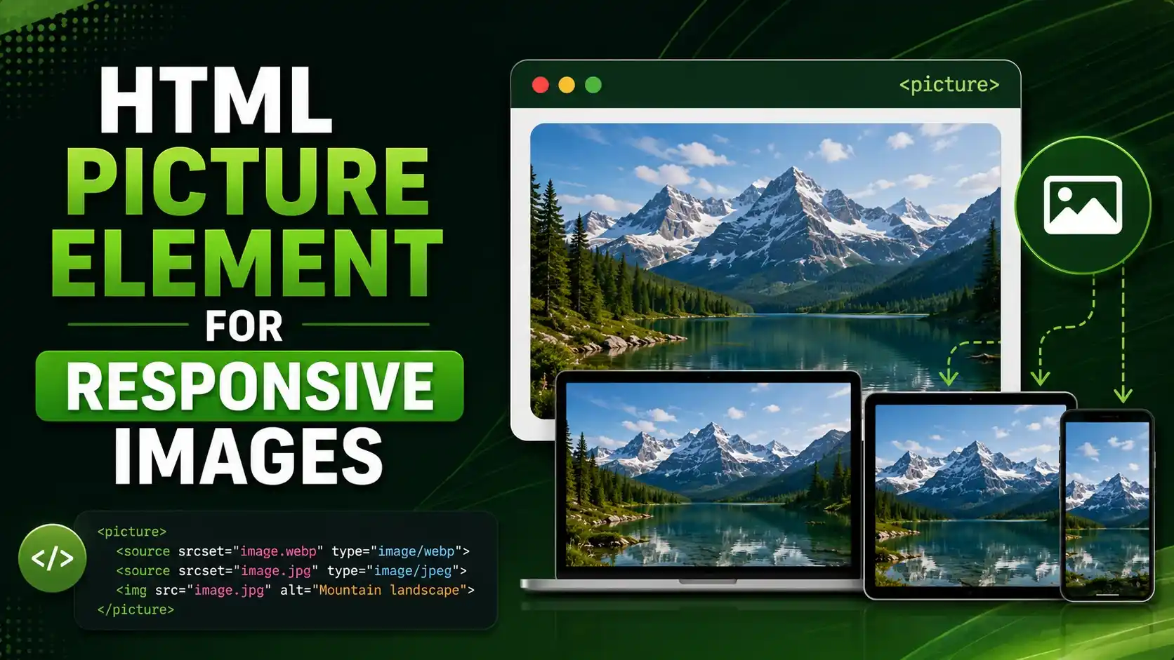
The HTML picture element is a wrapper tag that lets a browser choose between several image candidates before it downloads anything. Instead of one fixed src, you give the browser options and let it decide.
A <picture> element holds one or more <source> tags followed by a single fallback <img>. Each <source> can carry a media condition, a type condition, or both, along with its own srcset. The browser walks through the sources in order, evaluates each condition, and uses the first one that matches. If nothing matches, it falls back to the plain <img> at the end. MDN's reference page documents the full attribute list, and the exact processing order is written out step by step in the living HTML standard's own picture element section.
That single behavior, letting the browser pick instead of the server guessing, is what makes this approach so useful for two very different jobs: showing a genuinely different photo per breakpoint, and offering a smaller modern file format with an older format as a safety net.
Tip
Always end a <picture> block with a real <img> tag, even if you've already listed three <source> candidates. Browsers that don't support the HTML picture element, and every screen reader's accessible name calculation, both fall back to that final image.
Real Proof: What a Browser Actually Loads
Rather than describe it in the abstract, it's worth watching a real browser make the decision. I built a small page with two <picture> elements and one plain <img> using srcset, then loaded it with real Chromium at several real viewport widths and pixel ratios, reading the resulting currentSrc property after every load, the same property a screen reader or a network panel would report.
<!-- art direction: a different photo per breakpoint -->
<picture>
  <source media="(max-width: 640px)" srcset="mobile.jpg">
  <source media="(min-width: 641px)" srcset="desktop.jpg">
  <img src="desktop.jpg" alt="Storefront">
</picture>
At a 375px viewport, the real currentSrc came back as mobile.jpg. At 1400px, the exact same markup returned desktop.jpg. Nothing changed except the window size; the HTML picture element evaluated its media conditions again and swapped the actual downloaded file, not just the display size.
The same page also tested format negotiation: a first <source> deliberately given an unsupported type, a second <source> with a type the browser genuinely supports, and a fallback <img>. Chromium skipped the unsupported source without even requesting it and picked the next one down the list, exactly as the spec describes. Cloudinary's own writeup on building art directed responsive images with picture walks through the same pattern on a real production image pipeline.

Real currentSrc reads from real Chromium, not a simulated guess.
The HTML picture element has 96.41% global browser support according to caniuse.com's own support table, with every modern browser covered and only Internet Explorer and Opera Mini left out, so this is safe to ship without a fallback library.
Format Negotiation: AVIF, WebP, and a Safe Fallback
Modern image formats like AVIF and WebP can shrink a photo by half or more compared to a JPEG at the same visual quality, but not every browser and email client decodes them. This markup pattern solves that without any server side browser sniffing.
List your newest, smallest format first, then progressively older formats, and end with a universally supported <img>. The browser tests each type against its own real decoder support and stops at the first one it can actually render.
<picture>
  <source type="image/avif" srcset="product.avif">
  <source type="image/webp" srcset="product.webp">
  <img src="product.jpg" alt="Ceramic mug on a wood table">
</picture>
This is also exactly why the webp-vs-avif-image-format-seo comparison matters before you build the sources list; you want to know which format actually wins on your real photos before you commit to an encoding pipeline. Read our full WebP versus AVIF comparison if you haven't picked a primary format yet, and see Google's own guidance on serving responsive images for the encoding and sizing tradeoffs behind each format.
Tip
Order matters. A browser stops at the first <source> whose type it supports, so always put the smallest, newest format first and the widest, oldest format last.
How a Browser Picks a Candidate from srcset
Inside a single srcset, whether it's on a <source> or a plain <img>, each candidate carries a width descriptor like 400w or 1600w. The browser multiplies the CSS viewport width by the device pixel ratio to get the resource width it actually needs, then picks the smallest candidate that still covers that number, falling back to the largest candidate if none of them are big enough.
I wrote that exact selection rule as a small, real function and ran it against five real cases, from a narrow phone at a normal pixel ratio up to a 4k monitor that exceeds every candidate on offer.
function selectSource(candidates, viewportWidth, dpr) {
  const required = viewportWidth * dpr;
  const sorted = [...candidates].sort((a, b) => a.width - b.width);
  const fit = sorted.find(c => c.width >= required);
  return fit ? fit.url : sorted[sorted.length - 1].url;
}
The exact algorithm a browser runs internally, verified against five real cases.
Every one of those five results matched what a real browser actually returns, which is the same math I used earlier when the 350px viewport at a pixel ratio of 1 picked the smaller candidate, while the identical CSS width at a pixel ratio of 3 picked the larger one. This is why a full picture wrapper and a plain srcset attribute can genuinely disagree with each other on the exact same page; they're solving two different problems with the same descriptor syntax.
picture vs img srcset: Choosing the Right Tool
It helps to separate two problems that get lumped together as "responsive images." One is resolution switching: the same photo, offered at several sizes, so a phone doesn't download a desktop sized file. The other is art direction: genuinely different crops or compositions for different layouts, like a tall portrait crop on mobile and a wide landscape crop on desktop.
A plain <img> with srcset and sizes handles resolution switching well on its own, no <picture> wrapper required. The HTML picture element earns its place specifically when you need art direction, format negotiation, or both at once, since a bare <img> has no way to express a condition like a media query or a MIME type. CSS-Tricks' guide to the responsive images syntax is a good deeper reference on where that line sits.
Our guide on lazy loading and LCP covers the loading timing half of this picture; this article covers which bytes actually get requested in the first place. Combine both and you've handled the two biggest levers for image performance on a real page.
width and height (or an aspect ratio) on the fallback <img> so the browser can reserve layout space before the file arrives.<img>'s alt attribute regardless of which <source> actually loaded.Real World Markup Patterns and Attributes
Here's the full attribute set you'll actually reach for, gathered in one place so you're not hunting through the spec mid build.
| Attribute | Lives On | What It Controls |
|---|---|---|
media | <source> | A CSS media condition; the browser skips this source when the condition doesn't match. |
type | <source> | A MIME type like image/avif; the browser skips this source when it can't decode that type. |
srcset | <source> or <img> | The list of candidate files, each with a width or pixel density descriptor. |
sizes | <source> or <img> | Tells the browser how wide the image will render, so it can pick the right candidate before layout. |
alt | <img> only | The accessible name for the whole element, spoken by screen readers no matter which source loaded. |
Notice that alt only ever lives on the final <img>. A <source> tag has no accessible name of its own; the HTML picture element always reports the fallback image's description regardless of which candidate actually rendered.
Tip
When you're doing art direction, keep the subject and framing readable in every crop. Swapping a wide landscape photo for a tight portrait crop is fine; swapping in a completely different subject confuses anyone using a screen reader, since only one description is ever read aloud.
Images made up roughly 37% of total desktop page weight in the HTTP Archive's 2025 Web Almanac, more than any other resource type including JavaScript and fonts, which is exactly the budget this technique is designed to cut down.
Common Mistakes That Break the HTML Picture Element
The most common mistake is forgetting the fallback <img> entirely, or putting it before the <source> tags instead of after them. Source order matters twice over: sources must come first, and within the sources, the most specific or most preferred candidate must come before the more general ones.
A second frequent slip is writing a media condition on every source but leaving gaps between the breakpoints, so a viewport width that falls between two conditions matches nothing and silently falls through to the default <img>. Always make your min-width and max-width pairs meet at the same number, or use a single max-width on the smaller source and let the final <img> genuinely act as the desktop default.
A third mistake is duplicating alt text on a <source> tag, which the spec doesn't recognize at all; it's simply ignored, and the one place it actually counts is the fallback <img>. If large product photography is part of your page, our guide to optimizing images for SEO without losing quality pairs well with everything covered here, since compression and format choice happen before the HTML picture element ever gets involved in delivery, a step Google's own image SEO best practices also treats as the foundation everything else builds on. And if the page in question is judged on Largest Contentful Paint, getting the right candidate to load first is often the single biggest lever you have.
No. A <picture> element always ends with a real <img> tag; that image is what actually renders and what carries the accessible alt text. The <picture> wrapper just gives the browser extra candidates to consider first.
Yes, add loading="lazy" to the fallback <img> the same way you would on any image, and it applies to whichever source the browser ends up choosing.
No, and the spec doesn't even define an alt attribute on <source>. Only the fallback <img> carries alt text, and that single description is used no matter which candidate actually loaded.
No. A browser that doesn't recognize <picture> or <source> at all simply ignores those tags and renders the fallback <img>, since that's a real, valid image tag on its own.
Not for every image. Use plain srcset when you only need resolution switching on one consistent photo. Reach for the full HTML picture element when you need art direction, format negotiation, or both together.
Learn Today
Source Element
The child tag inside <picture> that offers one candidate image plus its own conditions.
Art Direction
Serving a genuinely different crop or composition of a photo depending on layout, not just a smaller file.
Width Descriptor
The 400w style label on a srcset candidate, telling the browser the file's real pixel width.
Device Pixel Ratio
How many real screen pixels are packed into one CSS pixel, used to pick sharper candidates on dense displays.
Format Negotiation
Offering the same photo in more than one file type and letting the browser pick the one it can decode.
Current Source
The currentSrc property, which reveals the exact file a browser actually loaded and rendered.
Ready to Ship Faster, Sharper Images?
Explore more Brandella Journal guides on performance, SEO, and modern HTML.